Layouts with Bootstrap 4: how to create a responsive web 2

by Silvia Mazzetta Date: 08-12-2019 bootstrap 4 bootstrap responsive web design

Here we are with the second part of the guide: Layouts With Bootstrap 4


Horizontal alignment


To align the columns horizontally we can use justify-content-value classes, which use the justify-content property of the flexible model:

justify-content-start, to align to the left (default) justify-content-center, to align the center justify-content-end, to align to the right justify-content-between, to align with equal spaces between columns justify-content-around, which is similar to the previous one with equal space to the left and right of each column

 
.justify-content-start {
-ms-flex-pack: start !important;
justify-content: flex-start !important;
}
.justify-content-end {
-ms-flex-pack: end !important;
justify-content: flex-end !important;
}
.justify-content-center {
-ms-flex-pack: center !important;
justify-content: center !important;}
.justify-content-between {
-ms-flex-pack: justify !important;
justify-content: space-between !important;
}
.justify-content-around {
-ms-flex-pack: distribute !important;
justify-content: space-around !important;
}
 

In this example the columns are aligned to the left on a justify-content-start basis:

 
<div class="container text-white">
<div class="row justify-content-start bg-dark">
<div class="col-auto bg-primary">col-auto</div>
<div class="col-auto bg-danger">col-auto</div>
<div class="col-auto bg-warning text-dark">col-auto</div>
</div>
</div>
 

Bootstrap 4 alignment horiztal

In this example the columns are aligned to the right by the use of justify-content-end:

 
<div class="container text-white">
<div class="row justify-content-end bg-dark">
<div class="col-auto bg-primary">col-auto</div>
<div class="col-auto bg-danger">col-auto</div>
<div class="col-auto bg-warning text-dark">col-auto</div>
</div>
</div>
 

bostrap 4 align horizontal

In this example the columns are aligned in the center thanks to justify-content-center:

 
<div class="container text-white">
<div class="row justify-content-center bg-dark">
<div class="col-auto bg-primary">col-auto</div>
<div class="col-auto bg-danger">col-auto</div>
<div class="col-auto bg-warning text-dark">col-auto</div>
</div>
</div>
 

In this example the columns are aligned with equal spaces between them when using justify-content-between:

 
<div class="container text-white">
<div class="row justify-content-between bg-dark">
<div class="col-auto bg-primary">col-auto</div>
<div class="col-auto bg-danger">col-auto</div>
<div class="col-auto bg-warning text-dark">col-auto</div>
</div>
</div>
 

bootstrap 4

In this example the columns are aligned with equal spaces between them when using justify-content-around:

 
<div class="container text-white">
<div class="row justify-content-around bg-dark">
<div class="col-auto bg-primary">col-auto</div>
<div class="col-auto bg-danger">col-auto</div>
<div class="col-auto bg-warning text-dark">col-auto</div>
</div>
</div>

bootstrap 4 nesting rows

READ ALSO THE FIRST PART : Layouts with Bootstrap 4: how to create a responsive web

boostrap 4 align content

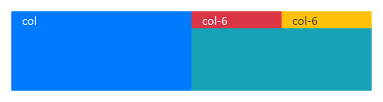
Rows inside rows: nesting


Columns can contain other rows in turn, to subdivide their contents. However, a row cannot have a row as a direct daughter, it must always be within a column:

 
<div class="container text-white">
<div class="row bg-dark h-25">
<div class="col bg-primary">col</div>
<div class="col-6 bg-info">
<div class="row">
<div class="col-6 bg-danger">col-6</div>
<div class="col-6 bg-warning text-dark">col-6</div>
</div>
</div>
</div>
</div>

bootstrap rows

READ ALSO: Layouts With Bootstrap 4: How to Create a Responsive Web

 
by Silvia Mazzetta Date: 08-12-2019 bootstrap 4 bootstrap responsive web design hits : 3594  
 
Silvia Mazzetta

Silvia Mazzetta

Web Developer, Blogger, Creative Thinker, Social media enthusiast, Italian expat in Spain, mom of little 9 years old geek, founder of  @manoweb. A strong conceptual and creative thinker who has a keen interest in all things relate to the Internet. A technically savvy web developer, who has multiple  years of website design expertise behind her.  She turns conceptual ideas into highly creative visual digital products. 


Related Posts

Starting with Bootstrap-Vue step by step

Today we will show you how to use BootstrapVue, describe the installation process and show basic functionality. The project’s based on the world's most popular CSS framework - Bootstrap, for building…

Bootstrap 5 beta2. What offers?

Since the release of the Bootstrap 4 is three years, in this article we will present what is new in the world’s most popular framework for building responsive, mobile-first sites.…

Layouts with Bootstrap 4: how to create a responsive web

Responsive or adaptable web design is a design methodology in which the appearance of the web page adapts to the resolution of the device with which it is being viewed,…

Best Open-Source Javascript Date Picker Plugins and Libraries

For date pickers, selecting menus is a common choice as they are simple to set up. But I suppose our customers deserve better after centuries of using MM / DD…

Chrome 38 Introduces a Responsive Design View

Chrome 38 has introduced a responsive design view in Chrome Developer tools. It allows you to view the available breakpoints for the loaded site. Clicking each of the bars resizes…

318 USEFUL TWITTER BOOTSTRAP RESOURCES #6

How Tos Tutorials and Instructions on using Bootstrap Articles CUSTOMIZING BOOTSTRAP Tips and recommendations on getting started with LESS and Bootstrap customization. TWITTER BOOTSTRAP TUTORIAL Up and running with Twitter Bootstrap in 20 Minutes ADDING…

10 CSS Media Query Snippets

Responsive Web Design has gained huge popularity and demand over the years. With novel gadgets being developed every year it is necessary for a Web Developer to make sure that…

How to create Responsive Content Using CSS Regions

CSS Regions allow content to flow across multiple areas called regions.   With CSS Regions you can separate the content from the layout therefore you can create responsive content very easily. Let's…

Bootstrap 3 RC2 released

Bootstrap just cut a new release for Bootstrap 3, RC2. It's a big release as lots has changed, but that should all be for the better. From the official Blog: Key…

32 best bootstrap tools and generators for web developers

If you are developer, you must be aware of the bootstrap. If you introduce it to your website, your website’s popularity will get a boost for sure. Why? Because Bootstrap has…

29 Awesome jQuery Responsive Navigation Menus

In this post we will show 29 beautiful and awesomel jQuery responsive navigation menus. All the menus are compatible with all modern browsers and mobile devices and are suitable for web…

12 Free Tutorials for Create Responsive Menu

As RWD (responsive design) rapidly increases in popularity, we felt we would need some new solutions or techniques for managing the navigation/menu on smaller screened devices. Planning and building a web…

Clicky