Differences between Bootstrap 4 and 5 beta.
Since the release of the Bootstrap 4 is three years, in this article we will present what is new in the world’s most popular framework for building responsive, mobile-first sites. If you want to know what are the significant changes that come with the next version 5 which is in beta, read further.
Bootstrap 5 Beta2
Well we all know the advantages of working with Bootstrap - it helps with responsive design, we can produce our work faster and easier, and it's free. After alpha that was officially released on 16 June 2020, we now have v5.0.0-beta2 which is currently the latest version of the package (launched on 7 December 2020). There isn't an official release date of Bootstrap 5 yet but since it was expected already in year 2020, there is quite a lot of work done on the new version.
The Bootstrap team improved existing features and components, fixed some issues, removed support for older browsers, dropped jQuery for regular JavaScript, and embraced more future-friendly technologies like CSS custom properties as part of Bootstrap tools. Let's talk about the changes in more detail, shall we?
Major changes
First you might spot the new updated logo.

Dropdown Menu Alignment options
There were some issues before, now they are solved and we have options like dropstart, dropend, separate text and background color documentation, scrolling navbar, form updates.
Faster load is achieved by lighter file size in comparison to previous version.
Larger Breakpoint - Grid tier XXL
What might come handy for building responsively especially on larger screens is addition of the Extra extra large breakpoint with class xxl. We would have better control for larger devices like desktop monitors with 1400px and up.
Removed JQuery
You might be delighted, you might be disgusted, but the truth is the JQuerry has been dropped. After more than 8 years there is no need for this library, instead the plain vanilla Javascript is being used. We guess with less we really could do more here..

Navbar Optimization
All navbars now require a container within the navbar for the content to be responsive. This should simplify spacing requirements and remove the need for extensive CSS overrides.
Additionally, they also implemented a dark version of the dropdown menu with black background.
Custom properties
Adding modern features like CSS custom properties is possible thanks to phasing out Internet Explorer support.
All bootstrap custom properties are prefixed with bs- to avoid conflicts with other CSS.
Custom Utilities API
There is now a utility API - a Sass-based tool to generate utility classes based on Sass maps. We are now free to override or create a set of utility classes via Sass. It is also possible to use the state option to generate pseudo-class variations such as :focus or :hover .
Dropped IE10,11 support
Like previous versions, it continues with support of Google Chrome, Firefox, Internet Explorer, Opera, and Safari, which haven't changed. Changed however is that it drops support for IE10 and IE11. If you require Internet Explorer support, use Bootstrap 4. Older versions of Bootstrap were phasing out the previous versions of IE, but this time this Microsoft browser seems to have been banned altogether. This means that we can have more modern CSS items.
Components and Spacing
Cumbersome changes are happening in spacing.
Considering renaming some variables, utilities and mixings with some more logical names, for example left is now start and right is now end, we are not impressed with that, it means we can have a hard time to figure out what is the problem when your code isn't working due to some small change in naming.
For example CSS margin-left is now represented by class ms-5 (margin start spacer 5), padding-right is now pe.

Rewriting the grid to support columns placed outside of rows
The column classes can now be used stand-alone. Whenever they are used outside a .row , horizontal padding won’t be added.
Gutters
Some of the CSS classes are removed like form-inline but some are added - gutters for example.
Gutters are the padding between columns or rows, used to space and align content in a grid system.
The gutter width will be based on rem instead of px.
g-*, gx-*, gy-*
Updated forms
Forms are now in its main category and support form labels that float over your input fields.

Expanded Color Palette
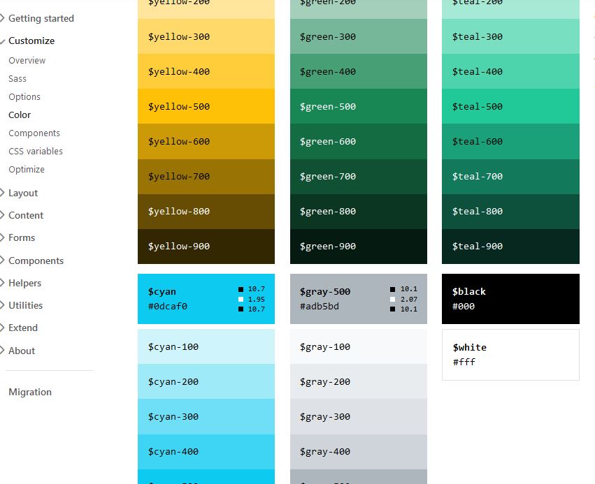
They’ve updated the color system to improve color contrast and added tints and shades for every color.
Blue and pink base colors are becoming a bit darker.
Present now are different shades such as $blue-300 , etc.
Also now we have separate documentations for text color and background color.
Own Set of SVG Icons
Bootstrap Icons is a growing library and in the latest version they’ve added a custom set of SVG icons. Nowadays there are over 1300 free, high quality icons. Even more, we couldn't be happier that with the new release comes new icons alignment similar to FontAwesome.
![]()
Responsive Fonts Sizes (RFS)
RFS is a unit resizing engine that offers many possibilities to resize virtually every value for any CSS property.
It is a preprocessor or postprocessor-powered-mechanism and it automatically calculates the appropriate values for fonts based on screen size.
Now you can have a responsive design in the form of layout but also the font size will change dynamically by default. This will be handy when we need to handle different modern devices, the fonts are now based on the user's viewport.
Removed Card Decks
Card deck class is removed in beta2 in favor of grid cards which adds more flexibility over responsive behavior.
Migrating the documentation from Jekyll to Hugo written in Go.
Further, separation from Jquery shows moving testing infrastructure from QUnit to Jasmine.
Removed Jumbotron
The Jumbotron component is removed.
Popper v2
Tooltips and popovers are powered by newer version of Popper.js.
Changes that are coming soon
- Implementing an offcanvas menu
Changes that are being evaluated
- Sass module system
- Increased usage of CSS custom properties
- Embedding SVGs in HTML instead of CSS
Migrating to v5
Track and review changes to the Bootstrap source files, documentation, and components to help you migrate from v4 to v5 is possible also on their official Github repository. Until the development team will release the stable version it's better to always check the open issues or consult the migration tab directly on the Bootstrap site.
github.com - migration.md
getbootstrap/com - migration
Conclusion
Latest release, Bootstrap 5, yet in development, focuses on improving version 4’s codebase with as few major breaking changes as possible. Furthermore Bootstrap development team has announced that the next beta update might be promoted to the stable version.
Overall we're excited that this major front-end framework keeps evolving. If you haven't tried it yet, we strongly encourage you to check it out.
Image by Tibor Kopca

