
Responsive Web Design has gained huge popularity and demand over the years. With novel gadgets being developed every year it is necessary for a Web Developer to make sure that the Website they design is compatible with all the various gadgets that are in the market.
CSS3 Media Queries help you add great deal of Media Device Responsiveness to your websites.
The best thing about the Media Queries is that they not only focus on specific classes of devices or particular devices but rather they will allow you to actually examine the physical characteristics of any gadget or device.
There are a number of different media queries that you can use on your design, if you don't know where to start with media queries here is a good boilerplate to go with.
This snippet gives you a generic base for your media queries but if you want to target a specific device then you need to change these media queries.
Here is a list of some interesting Media Query Code Snippets for top-notch trendy Gadgets in the market :
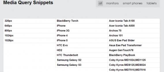
Here are some example snippets.
1. iPhone4
@media only screen and (-webkit-min-device-pixel-ratio : 1.5), only screen and (min-device-pixel-ratio : 1.5) { }
2. IPhone5
@media screen and (device-aspect-ratio: 40/71) { } or @media screen and (device-width: 320px) and (device-height: 568px) and (-webkit-device-pixel-ratio: 2){ }
3. Samsung Galaxy S2
@media only screen and (device-width: 320px) and (device-height: 533px) and (-webkit-device-pixel-ratio: 1.5) {}
4. Blackberry Torch
@media screen and (max-device-width: 480px) { }
5. Blackberry Playbook
c) Code for Applying Styles in Portrait Mode : @media only screen (max-device-width: 600px) and (orientation: portrait) { } d) Code for Applying Styles in Portrait Mode : @media only screen (max-device-width: 1024 px) and (orientation: portrait) {}
6. Samsung S3
@media only screen and (-webkit-device-pixel-ratio: 2) { }
7. Google Nexus 7
@media screen and (device-width: 600px) and (device-height: 905px) and (-webkit-min-device-pixel-ratio: 1.331) and (-webkit-max-device-pixel-ratio: 1.332) { }
8. IPad Mini
@media screen and (device-width: 768px) and (device-height: 1024px) and (-webkit-device-pixel-ratio: 1) { }
9. IPad 3
Landscape
@media (max-device-width: 1024px) and (orientation: landscape) { }
Portrait
@media (max-device-width: 768px) and (orientation: portrait) { }
10. Galaxy Tab 10.1
Landscape
@media (max-device-width: 1280px) and (orientation: landscape) { }
Portrait
@media (max-device-width: 800px) and (orientation: portrait) { }

Janeth Kent
Licenciada en Bellas Artes y programadora por pasión. Cuando tengo un rato retoco fotos, edito vídeos y diseño cosas. El resto del tiempo escribo en MA-NO WEB DESIGN AND DEVELOPMENT.
Related Posts
How to make your own custom cursor for your website
When I started browsing different and original websites to learn from them, one of the first things that caught my attention was that some of them had their own cursors,…
8 benefits of having a website for your business
At this moment, the Internet is a phenomenon that is sweeping the world. It has been able to interconnect millions of users all over the planet. People have made the…
Open source web design tools alternatives
There are many prototyping tools, user interface design tools or vector graphics applications. But most of them are paid or closed source. So here I will show you several open…
Secret iPhone codes to unlock hidden features
We love that our devices have hidden features. It's fun to learn something new about the technology we use every day, to discover those little features that aren't advertised by the…
How to access webcam and grab an image using HTML5 and Javascript
We often use webcams to broadcast video in real time via our computer. This broadcast can be viewed, saved and even shared via the Internet. As a rule, we need…
How to Send Email from an HTML Contact Form
In today’s article we will write about how to make a working form that upon hitting that submit button will be functional and send the email (to you as a…
Use the SRCSET attribute to improve your SEO
There is a new standard HTML attribute that can be used in conjunction with IMG called SRCSET. It is new and important as it allows webmasters to display different images…
How to multiply matrices in JavaScript
It may seem strange to want to know how to multiply matrices in JavaScript. But we will see some examples where it is useful to know how to perform this…
JavaScript Formatting Date Tips
Something that seems simple as the treatment of dates can become complex if we don't take into account how to treat them when presenting them to the user. That is…
How to set up your Android phone: learn how to get your new phone up and running
If you've just bought a great new Android phone, you'll want to start using it as soon as possible. You'll see that it's not hard to get the initial set-up and…
5 Terrific iOS-Friendly Canva Alternatives to Upgrade Your Marketing Visuals
Sometimes you want to use your iPhone to create compelling, engaging marketing visuals, and as awesome as Canva is, many of us are interested in seeing what other options are…
Top tools for UX design and research
This article is a compilation of the "ux tools" I have tested in recent years. I've separated the tools by categories, although I recommend you to take a look at all…