Use the SRCSET attribute to improve your SEO

by Silvia Mazzetta Date: 30-04-2021 css css3 design seo

There is a new standard HTML attribute that can be used in conjunction with IMG called SRCSET. It is new and important as it allows webmasters to display different images based on the size of the device, and without using javascript or other special code. This means we can serve smaller images for mobile devices, improving load times. And mobile websites that load much faster means, for those of us working in search engine positioning, the difference between appearing above or below our competitors in the search engines.

In addition to improving the loading time of a website, the SRCSET attribute additionally provides a new way to improve the user experience.

How to use the SRCSET attribute

The SRCSET attribute is used inside the IMG element. Let's look at the typical HTML code for an image:

<img src="/img/web-positioning.jpg" alt="search engine optimisation tips" />

From this we need to resize the main image to fit the size of smaller devices. In this example we will resize it to 360, 550, 800 and 1,024 pixels, leaving us with a total of 5 images. Note: You can create your own image sizes, this is just an example.

Then link to those images using the SRCSET attribute. The values of the attribute are the image and the minimum screen width. If you have more than one image you must separate each image and additional width value using commas.

<img src="/img/web-positioning.jpg" srcset="/img/web-positioning-360.jpg 360w, 
/img/web-positioning-550.jpg 550w, 
/img/web-positioning-800.jpg 800w, 
/img/web-positioning-1024.jpg 1024w" 
alt="search engine optimisation tips" />

SRCSET also allows you to indicate whether an image should only be displayed on high definition / DPI / Retina displays. This is done by adding 2x to the end of the value.

<img src="/img/web-positioning.jpg" 
srcset="/img/web-positioning-360.jpg 360w 2x" 
alt="search engine optimisation tips" />

Using SRCSET is a bit more tedious than using just an image, but the benefit in loading speed is worth it. The good news is that WordPress 4.4 supports SRCSET natively, so it will do most of the work.

How to use SRCSET to improve User Experience (UX)

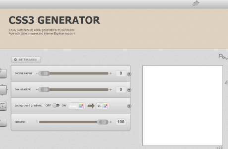
The native implementation of SRCSET in WordPress will, by default, only resize the image. But what happens if the smaller version of a given image makes it difficult to read on mobile devices? For example, the following image looks fine on desktop computers, but contains too much information for a mobile device:

common sei issues

source: raventools

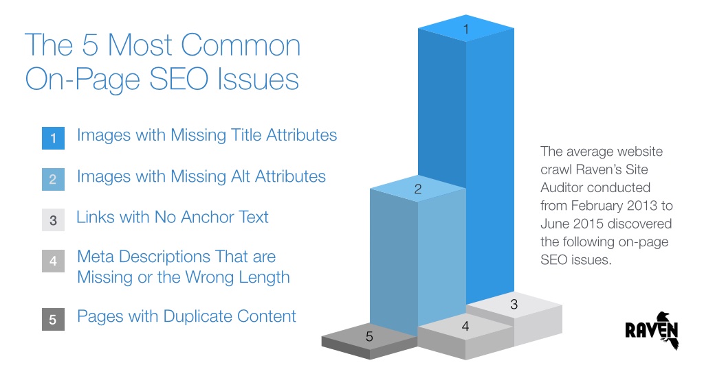
To provide the best user experience on mobile devices, we can create a completely different image for mobile devices. For example, we can display this image using SRCSET:
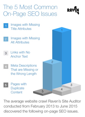
most common seo issues

source: raventools

This provides a better user experience. It makes the website load faster, and the improved user experience increases the likelihood that the article will be shared.

We recommend everyone to start using SRCSET as soon as possible to improve UX and SEO for our websites.

Abstract vector created by vectorjuice - www.freepik.com
 
by Silvia Mazzetta Date: 30-04-2021 css css3 design seo hits : 3295  
 
Silvia Mazzetta

Silvia Mazzetta

Web Developer, Blogger, Creative Thinker, Social media enthusiast, Italian expat in Spain, mom of little 9 years old geek, founder of  @manoweb. A strong conceptual and creative thinker who has a keen interest in all things relate to the Internet. A technically savvy web developer, who has multiple  years of website design expertise behind her.  She turns conceptual ideas into highly creative visual digital products. 


Related Posts

Alternative tools for graphic design

There are many people today who only use the following for design purposes Canva as it is a really popular software and website and there is no denying that it…

New graphic window units - CSS

''Intercop 2022' is a project announced by Google, Microsoft, Apple and the Mozzilla Foundation to make all browsers offer the same web experience. The project has 15 focus areas and one…

Let's create a Color Picker from scratch with HTML5 Canvas, Javascript and CSS3

HTML5 Canvas is a technology that allows developers to generate real-time graphics and animations using JavaScript. It provides a blank canvas on which graphical elements, such as lines, shapes, images…

Why shouldn't we use black?

Nowadays it is becoming more and more common for web pages to have the option to set them in dark mode, or to base their aesthetics directly on black or…

How to make your own custom cursor for your website

When I started browsing different and original websites to learn from them, one of the first things that caught my attention was that some of them had their own cursors,…

Open source web design tools alternatives

There are many prototyping tools, user interface design tools or vector graphics applications. But most of them are paid or closed source. So here I will show you several open…

Nesting: future proofing CSS

Although not currently supported by browsers, there is a proposal for CSS nesting to support a feature that would provide better readability to native CSS, so in the future it…

Top tools for UX design and research

This article is a compilation of the "ux tools" I have tested in recent years. I've separated the tools by categories, although I recommend you to take a look at all…

Starting with Bootstrap-Vue step by step

Today we will show you how to use BootstrapVue, describe the installation process and show basic functionality. The project’s based on the world's most popular CSS framework - Bootstrap, for building…

Bootstrap 5 beta2. What offers?

Since the release of the Bootstrap 4 is three years, in this article we will present what is new in the world’s most popular framework for building responsive, mobile-first sites.…

Graphic design and its impact on Web Development

In today's article we will explain the concept of graphic design, its fundamentals and what it brings into web development. Graphic design is applied to everything visual, believe or not,…

Creating simple CSS spinner-loader

In today's article we will show you how to animate a basic loader that spins when some predefined action is defined, such as loading an image. That can be used…

Clicky