Enjoy 12 useful responsive menu navigation tutorials to improve your web design interface!
As RWD (responsive design) rapidly increases in popularity, we felt we would need some new solutions or techniques for managing the navigation/menu on smaller screened devices.
Planning and building a web site menu for mobiles will perhaps be the critical aspect of our responsive layout, not just with the coding but also having to decide what will stay and what will have to go to fit everything into the smaller screen.
It is a "tour de force" between both readability and the desire to show as much on the screen as possible.
Check out these various techniques and tutorials which are our choices following the most popular ideas for responsive navigation. There are obviously some other solutions out there, but this collection should give you ideas for getting started with your own responsive designs.
1. Basic Responsive “Three Line” Menu (CSS & jQuery)

This tutorial shows you how to build a "Three Line" Drop-down Menu for a Responsive Website in jQuery. All additional markup will be included dynamically using jQuery.
2. Responsive Multi-Level Navigation (CSS & jQuery)
In this approach to responsive navigation, we’re going to use an approach that can accommodate large, multi-level navigation menus using media queries and jQuery, whilst trying to keep our markup simple and our external resources minimal.
The aim is to build, on larger screens, a horizontal drop-down menu, with up to two levels of sub-menus that appear when the parent element is hovered over. And on smaller screens, a menu button that will display the menu vertically, displaying sub-menus when the parent element is clicked or touched.
3. Responsive Toggle Menu (CSS & jQuery)
It works thusly: when the browser window is at mobile sizes, the navigation bar "magically" transforms into a dropdown list. You can view a demo of it here.
The specs were pretty straightforward:
-
At mobile sizes, the navigation should display as a drop down menu.
-
When the user taps the dropdown, the links should slide open.
-
At tablet sizes and up, the navigation should display as a horizontal bar.
4. Animated jPanelMenu (jQuery Plugin)

jPanelMenu is a jQuery plugin that creates a paneled-style menu (like the type seen in the mobile versions of Facebook and Google, as well as in many native iPhone applications).
Just click on the menu button (the top left of this page) to see it in action.
Check out the changelog to see what’s new in version 1.3.0.
5. CSS: Responsive Navigation Menu (CSS-only)
A new technique to produce a responsive menu without having to use Javascript.
It uses clean and semantic HTML5 markup. The menu can be aligned left, center or right. Unlike the previous tutorial where it is clicked to toggle, this menu toggles on hover which is more user friendly. It also has an indicator to show the active/current menu item.
It works on all mobile and desktop browsers including Internet Explorer!
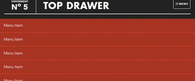
6. Smooth Responsive Dropdown Menu – Top Drawer(CSS & jQuery)

This tutorial demonstrates how to create a smoother reveal mobile menu using CSS3 rather than animating it with JavaScript.
What we need:
- CSS Transforms
- Modernizr
- FT Labs Fast Click (optional - for speedy tap events)
- JavaScript (I used jQuery, but you could easily do this with VanillaJS)
Method
Tap the menu icon in the top right. The click event will assign the class of active to the drawer container which alters the translate value to bring it into view.
Modernizr will detect whether the user's device is capable of CSS transforms, if it isn't we simply show and hide the menu after the button is pressed - no point in animating if it isn't going to work smoothly.
To set up the experiment we need to create a scenario similar to a box of matches, the box (in our case the top black heading) covers the match drawer beneath (our div with a class of drawer). We build the page as normal but pull the drawer up and off the canvas using the CSS Translate property and show it again in the active state for the div using Translate back to it's regular position. CSS Transitions allow us to create the smooth animation between the states.
7. Simple Responsive Navigation (CSS & jQuery)
A very simple approach for building a responsive menu from the ground up using CSS3 media queries and a little jQuery to display the menu on a smaller mobile screen.
8. Mobile Drawer-Style Menu (jQuery Plugin)
This jQuery Mobile Menu Plugin creates a drawer-style navigation on your mobile site, as seen on iOS.
9. MeanMenu – A Media Query Independent Navigation (jQuery Plugin)
A simple responsive jquery menu.
The Main Features
- Hide or show menu children
- Target navigation element to swap out with MeanMenu
- Orientation adjustment (centered menu will reposition when you tilt the device)
- Control screen width at which MeanMenu activates
- Expanding/Collapsing sub navigation
- Bundled with configurable CSS
- Quick to setup and configure
- Media Query independent
10. CSS3 Responsive Menu (CSS-only)

This tutorial aims to provide step by step instructions to enable you to create a responsive navigation menu that adapts to varying screen sizes, with the help of CSS media queries.
11. Simple & Responsive Mobile First Navigation (CSS-only)
We’re going to build a simple, responsive web site navigation. Our solution will help us place emphasis on the content of our page, arguably the top priority when designing for mobile. There’ll be no JavaScript involved, and we’ll tackle it from a Mobile First approach.
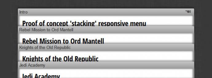
12. ‘Stacking’ Responsive Menu (Proof of Concept)

IMPORTANT: this solution is a proof of concept and should not be used in production. Having said that, go ahead and view the demo (link below) and resize your window and you will see the amazing ‘stacking effect’ of each of the pages sections.

