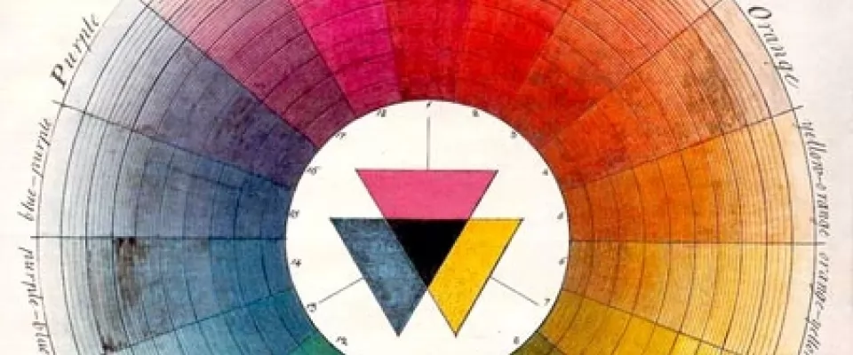
Color theory, also known as color psychology, can trace its roots to the 1490s, when Leonardo da Vinci wrote about it in his personal journals. Professional marketers today master the principles of color theory to lead prospective clients and customers into purchasing their products and services with such ease, that most people never know they have been subliminally controlled into making a buying decision.
When a business decides to create a logo or design their outlet or office etc they focus on the colors that best showcase their product and also help gain customers.
Marketers who master color theory when creating marketing campaigns understand it is the No. 1 way to control the emotional ebb and flow of the prospect's emotions. Unlike sales professionals who talk the prospects through the sales pitch, marketers may never communicate live with their prospects. They control the marketing campaign through strong copyrighting and using color theory to keep the eyes and mind of their prospects glued to the ad copy.
Below is a list of colors and their importance.
Red stimulates emotions to peak levels. The heart pumps faster and adrenalin surges to the brain, signaling something has or is about to happen. Strength, health, and vitality that’s what red stands for. When you see red – two of your basic needs come to surface, food and love. Blood is the essence of life and red blood is a sign of health. If you want your product to make an impact at POS, you can add the color red to its packaging e.g. selling a strawberry derived product or to a pamphlet or leaflet for distribution. This color even by itself will always make an impact.
Yellow triggers the brain to recognize fun and relaxation, renewed hope, love and comfort. It releases endorphins in the brain of peace and tranquility. The color associated with happiness, imagination and warmth. The color enhances concentration but also speeds metabolism. Too much yellow however has proven to increase temper tantrums etc.
In some countries, yellow has very different connotations. In Egypt, for example, yellow is for mourning. In Japan, it represents courage, and in India it’s a color for merchants.
Blue triggers chemicals in the brain to signal everything is great. Blue shows leadership, steadfastness and trust.
Unity, harmony, loyalty, dependability, caring and compassion these are all linked to this color. The color blue calms the body and helps you relax. This is why hospitals and bedrooms normally have blue as one of the basic colors (bedspreads/sheets etc). When blue is used in logos it is normally paired with white or a very pale/muted color. This is because too much blue (especially dark blue) can cause depression.
Green is associated with nature and the color most recognized for wealth, greed and envy. Green is health, vigor, fertility, wealth, growth, harmony and balance. Normally used as a color for branding organic or plant derived products, it is also used for play station and Xbox. Green is a very down-to-earth color. It can represent new beginnings and growth. It also signifies renewal and abundance. Alternatively, green can also represent envy or jealousy, and a lack of experience.
White Cleanliness, purity, simplicity and innocence is what the color white denotes. Mostly used to decrease the stronger effects of darker colors it is one of the most widely used colors in marketing. White is often associated with purity, cleanliness, and virtue. In the West, white is commonly worn by brides on their wedding day. It’s also associated with the health care industry, especially with doctors, nurses and dentists. White is associated with goodness, and angels are often depicted in white.
Black is – mystery, elegance, power, stylish and timeless. If your product is classy and you want it to stand out, then use black in your logo and your marketing strategy. Perfumes, cars, bags, mobiles whenever you have an upgrade or a product that you want known for its exquisite quality and high upgrades then black is the color for you. Too much black can be frightening...
Purple. Royalty, spirituality and sensuality that are what this color denotes. Feminism, sophistication, luxury are all implied when this color is used in business advertisements. Violet and indigo have been used to calm mentally unstable patients too much dark purple however is linked with the opposite effect.
In Thailand, purple is the color of mourning for widows. Dark purples are traditionally associated with wealth and royalty, while lighter purples (like lavendar) are considered more romantic.
In design, dark purples can give a sense wealth and luxury. Light purples are softer and are associated with spring and romance.
Pink. Softness, feminism, innocence, warmth and nurturing these are what the color pink is all about. Beauty products, handbags, clothes, accessories, shirts, sandals for females all have pink as a strong color in their logos as well as marketing campaigns.
In Brief…
A quick reference guide for the common meanings of the colors discussed above:
- Red: Passion, Love, Anger
- Orange: Energy, Happiness, Vitality
- Yellow: Happiness, Hope, Deceit
- Green: New Beginnings, Abundance, Nature
- Blue: Calm, Responsible, Sadness
- Purple: Creativity, Royalty, Wealth
- Black: Mystery, Elegance, Evil
- Gray: Moody, Conservative, Formality
- White: Purity, Cleanliness, Virtue
- Brown: Nature, Wholesomeness, Dependability
- Tan or Beige: Conservative, Piety, Dull
- Cream or Ivory: Calm, Elegant, Purity
Further Resources
- Color Meanings: A very thorough guide from About.com on color meanings.
- Color Wheel Pro: Color Meaning: Another excellent guide to color meanings.
- Color
- The Meaning of Colors in web Design. A little bit of psychology

