
Since as far back as the 1450s, typefaces have been used in printing ( Do you remember Gutemberg? His major work, the Gutenberg Bible, also known as the 42-line Bible, has been acclaimed for its high aesthetic and technical quality.). Lead alloys were often cast into letters (or wood was substituted with its own separate wood type typefaces) and laid out for printing purposes.
Much later in the 1950s-1970s, it became possible to produce printed type with phototypesetting using high resolution images of each character of a typeface. Early digital typesetters also started to appear in the 1970s.
Here we have listed 26 very useful typeface and font basics eBooks for designers.
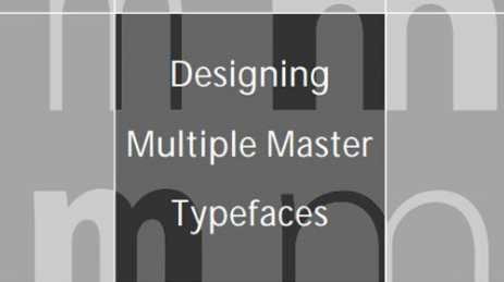
Adobe – Designing Multiple Master Typefaces
Technical Guidelines for Designing Multiple Master Tyepfaces
Chapter 1 Overview of Multiple Master Typefaces
Chapter 2 Technical Design Guidelines
Chapter 3 Multiple Master Font Naming Conventions
Adobe’s Typeface Design Process
Part 1 Design Considerations
Part 2 Adobe’s Multiple Master Typeface Design Process
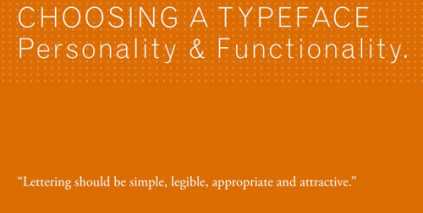
Choosing a Typeface – Personality and Functionality
Typography Basics: Typeface Classifications
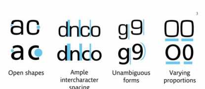
Balancing Typeface Legibility and Economy
A Brief History of Typefaces
Impression Management Using Typeface Design
Choosing a typeface for reading
What is the Right Typeface For Text?
Adobe – Typographic Terms
Introduction to Font Characteristics
An Evaluation of Typeface Design in a Text-Rich Automotive User Interface
The Right Font for the Job
The Typographer’s Glossary
Meet Your Type
Erik Spiekermann’s Typo Tips
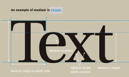
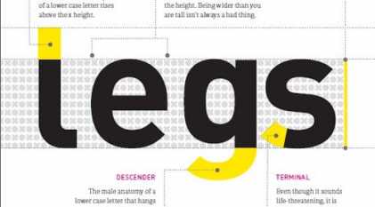
Typeface Anatomy
What is OpenType?
Styles,Weights,Widths
Helvetica – Complements and Alternatives
Webfonts
Free Fonts Are Not Always Free
27 Page Type Classification eBook
Understanding Typography Concepts
Typography and Readability
Typography Basics