To achieve interesting effects on your images, learn about the 'filter' and 'Backdrop-Filter' properties of CSS.
CSS filters are a very attractive feature of CSS that allows you to apply certain image effects, typical of photo retouching applications, such as sepia, variations in brightness or contrast (or others) on the fly in the browser itself, without making permanent changes to an image.
The backdrop-filter property is fantastic.
To understand it is necessary to know the CSS filter property.
It is used mainly in images and allows us to perform effects such as color change, blur, work with brightness, things that are usually done with Photoshop or other image editing software.
The filter is applied to an element by passing a filter function to the filter property.
The filters you can use are:
- blur( )
- opacity( )
- drop-shadow( )
- grayscale()
- sepia( )
- saturate( )
- invert( )
- contrast( )
- brightness( )
- hue-rotate( )
- url( ) — for applying SVG filters
- custom( )
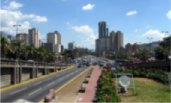
Blur()
Blur the content of an element. A value, which can be expressed in px, em or rem, is passed to it to determine the blur radius, so a higher value will create more blur.
Opacity( )
This function already exists in CSS, and it works the same way we apply it to some element.
It takes a value from 0 to 1, or a percentage, and determines the transparency of the image based on it.
img {
filter: opacity(.6);

}
Drop-shadow( )
It is similar to box-shadow, except that it allows you to shade the shape of the image and not the frame of the image.
Accepts from 2 (minimum) to 5 parameters.
Offset-x: Sets the horizontal displacement. Can be negative
Offset-y: Sets the vertical offset. Can be negative
Blur-radius: Sets the blur radius for the shadow. (Optional)
Spread-radius: sets the propagation radius. Expressed in px, rem or em (Optional)
Color: Sets the color of the shadow. (Optional)
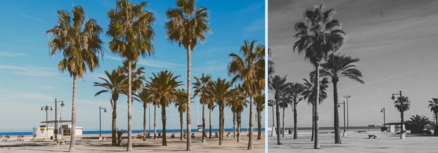
Greyscale( )
Converts the image to grayscale. A value of 100% is completely in grayscale.
img {
filter: grayscale(1);
}
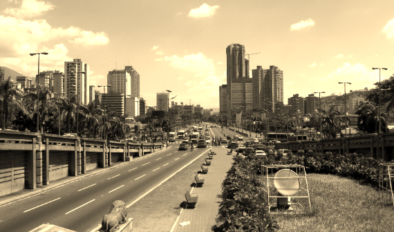
Sepia( )
Convert image to sepia.
img {
filter: sepia(.9);
}
Saturate( )
Alters the saturation of an element. 0%(0)gives a full grayscale element (with less saturation). 100%(1) gives an unchanged image.
To achieve an oversaturated image, values higher than 100% are applied.
img {
filter: saturate(200%);
}
Invert( )
Inverts the colors of an element.
img {
  filter: invert(2);
  }
Contrast( )
Adjusts the contrast of the element. A value of 0% will create a completely black image. A value of 100% will leave the image unchanged.
Just like saturation(), to increase the contrast our value should be higher than 100%.
img {
    filter: contrast(150%);
    }
Brightness( )
This works like the brightness control of a monitor, where we can play with the brightness of the image making it more or less bright, a 0% value creates a completely black image but as the value goes up to 100%, the original image gets brighter and brighter. The 100% value is the original image.
Setting something like 200% will make the image twice as bright as the original, ideal for setting up shots in low light!
img {
  filter: brightness(200%);
  }
Hue-rotate( )
It works the same as the rotate() property but instead of rotating the image, it rotates the tone of the image.
.hue-rotate { filter: hue-rotate(90deg); }
Url ( )
This filter allows you to apply any defined filter to an SVG file.
To use any CSS SVG filter, all you need to do is reference it using the "url" syntax
.url {
  filter: url()
  }
You can use multiple filters in one statement to create custom effects.
img {
  filter: cuttlefish(.5)
  contrast(1.8);
  }
The Backdrop-filter

While the filter; property helps us to apply effects to a certain element, the backdrop-filter property allows us to apply them but to the elements below.
For the property to have any visible effect, there must be 2 elements stacked on top of each other.
This allows you to make cool effects in your designs, especially if you start combining them with animations.
#Note: You must take into account that the use of this property may have adverse effects on performance, especially when applied to a high number of elements or a large area of the page, also this property is not accepted by all browsers
With backdrop-filter you can create many effects that previously took much more work and give that different touch to your designs.
Here are some examples of codepen that you can recreate.