Why is Facebook blue? According to The New Yorker, the reason is simple. It’s because Mark Zuckerberg is red-green color blind; blue is the color Mark can see the best.
Not highly scientific, right? That may not be the case for Facebook, but there are some amazing examples of how colors actually affect our purchasing decisions. After all, sight is the strongest developed sense one in most human beings. It’s only natural that 90% of an assessment for trying out a product is made by color alone.
So how do colors really affect us, and what is the science of colors in marketing, really? As we strive to make improvements to our product at Buffer, studying this phenomenon is key. Let’s dig into some of the latest, most interesting research on it.
First: Can you recognize the online brands just based on color?
Before we dive into the research, here are some awesome experiments that show you how powerful color alone really is. Based on just the colors of the buttons, can you guess which company belongs to each of them?
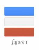
Example 1 (easy):
Example 2 (easy):
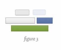
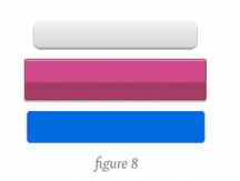
Example 3 (medium):
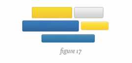
Example 4 (hard):
These awesome examples from YouTube designer Marc Hemeon, I think, show the real power of color more than any study could.
How many were you able to guess? (All the answers are at the bottom of this post!)
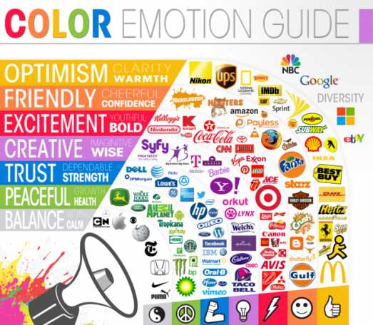
Which colors trigger which feeling for us?
Being completely conscious about what color triggers us to think in which way isn’t always obvious. The Logo Company has come up with an amazing breakdown which colors are best for which companies and why. Here are 4 great examples:
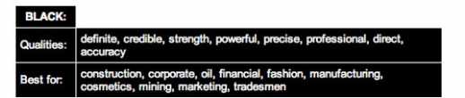
Black:
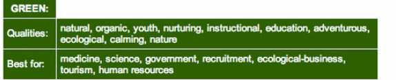
Green:
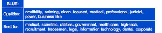
Blue:
Clearly, every one of these companies is seeking to trigger a very specific emotion:
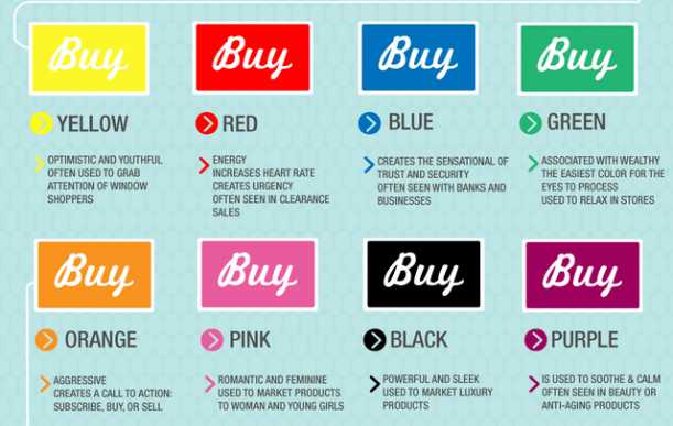
When we feel compelled to buy something, color can play a major role. Analytics company KISSmetrics created an amazing infographic on the science of how colors affect our purchases.
The role of green stands out to me as the most relaxing color we can use to make buying easier. We didn’t intentionally choose this as the main color for Buffer--although it seems to have worked very well so far.
At second look, I also realized how frequently black is used for luxury products. Here is the full infographic:
How to improve your marketing with better use of colors:
This all might be fairly entertaining, but what are some actual decisions we can apply today to our website or app? The answer comes yet again from some great research done by the good folks over at KISSmetrics.
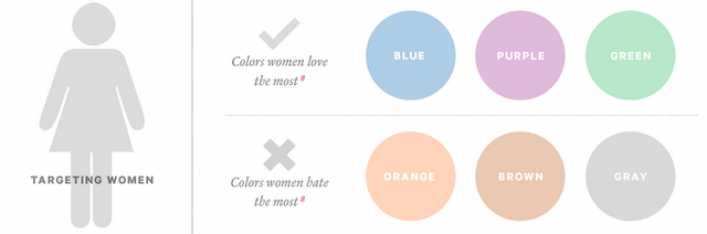
If you are building an app that mainly targets women, KISSmetrics suggests that women love blue, purple, and green, and dislike orange, brown, and gray.
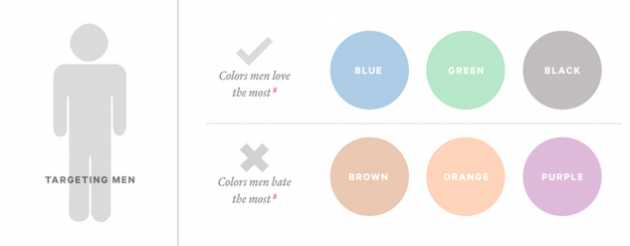
In case your app is strictly targeting men, the rules of the game are slightly different. Men love blue, green, and black, but can do without brown, orange, and purple.
In another experiment, Performable (now HubSpot) wanted to find out whether simply changing the color of a button would make a difference to conversion rates.
They started out with the simple hypothesis of choosing between two colors (green and red) and trying guess what would happen.
“Green connotes ideas like “natural” and “environment,” and given its wide use in traffic lights, suggests the idea of “go” or forward movement. The color red, on the other hand, is often thought to communicate excitement, passion, blood, and warning. It is also used as the color for stopping at traffic lights. Red is also known to be eye-catching.”
So, clearly an A/B test between green and red would result in green, the more friendly color. At least that was their guess. Here is what their experiment looked like:

So how did that experiment turn out? The answer was surprising: The red button outperformed the green button by 21%.
What’s most important to consider is that nothing else was changed at all: 21% more people clicked on the red button than on the green button. Everything else on the pages was the same, so it was only the button color that made this difference.
This definitely made me wonder: If we were to read all the research before this experiment and ask every researcher which version they would guess would perform better, I’m sure green would be the answer in nearly all cases. Not so much.
At my company, we’ve also conducted dozens of experiments to improve our conversion rates using changes of colors. While the results weren’t as clear, we still saw a huge change. One hypothesis is that for a social media sharing tool, there is less of a barrier to signup, which makes the differences less significant.
Despite all the studies, generalizations are extremely hard to make. Whatever change you make, treat it first as a hypothesis, and see if the actual experiment supports your ideas. Personally, I’m always very prone to go with opinion based on research I’ve come across. Yet, data always beats opinion, no matter what.
Quick last fact: Why are hyperlinks blue?
This is something that always interested me and is actually a fun story. In short, it's offers the highest contrast between the colors used on early websites.
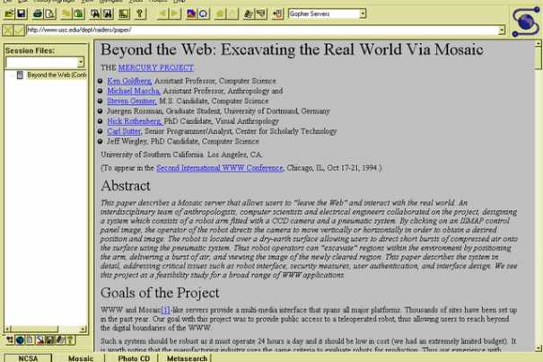
Here is the full explanation: “Tim Berners-Lee, the main inventor of the web, is believed to be the man who first made hyperlinks blue. Mosaic, a very early web browser, displayed webpages with a (ugly) gray background and black text. The darkest color available at the time that was not the same as the black text was that blue color. Therefore, to make links stand apart from plain text, but still be readable, the color blue was selected.”
I think it's fascinating that tweaking something as small as the color can completely change an outcome. What have been your findings in terms of colors and marketing? Tell me about it in the comments.
Solution to the riddle: Example 1: Facebook, Example 2: Google, Example 3: Flickr, Example 4: LinkedIn
Reprinted with permission from Buffer.
[Image: Flickr user Darrel Birkett]
source: http://www.fastcompany.com/