
Designing for the web has changed drastically over last years. The days of designing for rigid screen sizes that are set in stone has long gone. Websites now have to be suitable for different screen sizes, being used in very varied situations. This post is a compilation of 27 Web Apps & Resources we found useful when developing and designing responsive websites.
1. Retina.js

2. Screenqueri.es
3. Mediaqueri.es
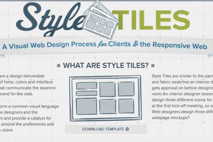
4. Style Tiles
5. Responsify
6. Gridpak
7. Adaptive Images
8. The Goldilocks Approach
9. Respo WordPress Theme
10. The Responsinator
11. Response JS
12. FitVids.js

13. Responsive PX
14. SelectNav.js
15. RefineSlide
16. Campaign Monitor Mobile Guide
17. Code a Responsive Navigation
18. Responsive Ad Checker
19. CSS3 Responsive Slider
20. Responsive Tables
21. HorizontalNav
22. Glisse.js
23. Codebomber
24. slabText

Syze
Ari WordPress Theme
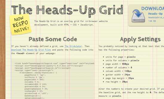
The Heads-Up Grid