Cumulative Layout Shift, one of the new Core Web Vitals metrics, is the first metric that focuses on user experience beyond performance. Unexpected movement of web page content is a major source of irritation for users on the web. The new cumulative design change metric helps developers understand the impact of this problem on their pages. Come learn how it developed and how you can monitor and debug it.
What is the Cumulative Layout Shift?
CLS is the unexpected change of web page elements while the page is still downloading and causes a bad user experience.
It's a very frustrating part of the web today you're trying to read a page and suddenly the content moves and you can't find your place or worse you try to click on something and end up clicking on another element. This is what is known as Visual Stability: do the elements on the page change in a way that users do not expect and potentially interfere with their interactions?
What is a good CLS score?
To provide a good user experience, sites should strive to have a CLS score of less than 0.1
A Cumulative Layout Shift (CLS) under helps ensure that the page is enjoyable. Design changes can be distracting to users. That's why it's important to keep Cumulative Layout Shift low, because changing pages can cause a poor user experience.
Maybe it looked good originally and an upgrade made things change or maybe it only changes in certain viewports on slow network connections.
This Cumulative Layout Shift metric helps developers address these issues by measuring how bad the page design change is and making it available in both lab tools and actual user monitoring.
The browser measures the instability of the design, first in how much of the visual area on the screen, so this is the region of impact. Cumulative Layout Shift analyzes the amount of visible content that was shifted in the graphic window and the distance that the affected elements were shifted.
Cumulative Layout Shift is becoming a classification factor
.Evaluation of the site's experience for a better website shows that future updates will be communicated in a more specific guide as to when these changes will take effect. Indeed, cumulative design change is becoming a classification factor. This metric is scheduled to become a ranking factor sometime in 2021.
What elements tend to cause Cumulative Layout Shift
- Images without dimensions.
- Ads, inlays and iframes without dimensions
- Contact forms
- Dynamically injected content
- Buttons
- Web sources that cause FOIT/FOUT
- Videos
- Actions that wait for a network response before updating DOM
The content may "jump" because an ad was inserted, for example. For responsive images, make sure that different image sizes for different views use the same aspect ratio. Google recommends using AspectRatioCalculator.com to calculate the aspect ratio. It's a good resource. Images and videos must have the height and width dimensions declared in the HTML.
Tools for developers. Measuring Cumulative Layout Shift
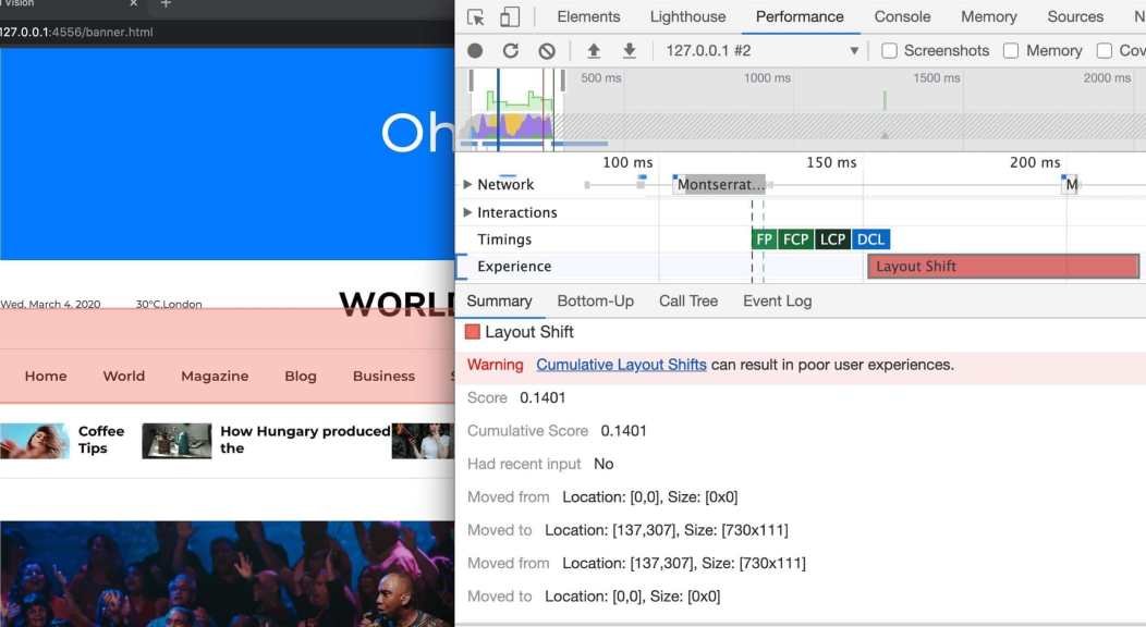
Lighthouse 6.0 and above includes support for measuring Cumulative Layout Shift in a laboratory environment. This version will also highlight the nodes that cause the biggest design change.
The Performance panel in DevTools highlights design changes in the Experience section starting with Chrome 84. The Summary view for a Layout Shift record includes the cumulative design change score as well as a rectangle overlay showing the affected regions.
It is also possible to measure real-world Cumulative Layout Shift aggregated at the source level using the Chrome User Experience Report. CrUX Cumulative Layout Shift data is available through BigQuery and a sample query to see Cumulative Layout Shift performance is available for use.
Ways to optimize cumulative design change
Use values font:display with your custom fonts
All those fancy google fonts could be causing FOIT and FOUT and you probably didn't think it would cause any problems.
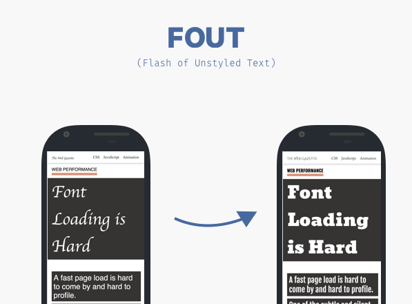
If you are wondering what FOIT and FOUT is, let me explain: When a browser needs a font from a web server, any items using that font will be hidden until the font resource has been completely downloaded. This is known as FOIT or invisible text flash.
Similarly, browsers display an alternate font in the font stack until the custom font is loaded. This creates a flash of text without style or commonly known as a FOUT.
Lighthouse can be your friend here in identifying exactly what is causing Cumulative Layout Shift. If the sources are guilty, there are some easy solutions to handle them. You can simply use font:display
You can minimize these effects by using font:display as auto , swap , block , fallback and optional .
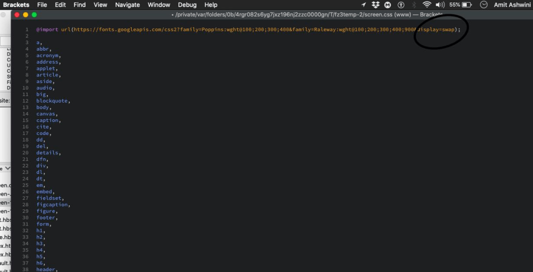
But if you want to be 100% sure that a design change is not taking place, you should use font:display together with . As I have used here:
Include width and height attributes in image and video elements
height and width specifications on images used to be an old and healthy practice, but with the popularity of responsive web design, it was lost. This is how you should use it:

Los navegadores web modernos ahora establecen la relación de aspecto predeterminada de las imágenes en función de los atributos de ancho de altura de una imagen. Por lo tanto, es una buena práctica configurarlos para evitar cambios de diseño.
img {aspect ratio: attr (width)/attr (height);}
This predicts an aspect ratio, based on the dimensional attributes before the image is loaded. It provides that information at the beginning of the design calculation. The aspect ratio is used to measure height as soon as an image is told it has a certain width.
When it comes to receptive images, srcset determines the images that the browser will allow you to choose from among the sizes of each image. To set width and height image attributes, each image must use the same aspect ratio.

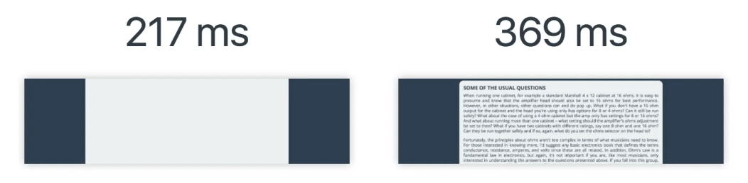
Setting dimensions in ads and inlays
The ads are among the main contributors to the design changes. Publishers and ad networks often support dynamic ad sizes. Due to higher click rates and more competing ads in the auction, ad sizes improve efficiency and therefore revenue. Unfortunately, due to ads pushing visible content you are viewing on the page, this can lead to a sub-optimal user experience.
You can try these steps to reduce the chances of high Cumulative Layout Shift due to advertising:
- Reserve static space for advertising space. That is, design the element before loading the ad tag library.
- When placing ads in the content flow, make sure that the size of the space is assigned to avoid changes. If loaded off-screen, these ads will not trigger design changes.
- When placing non-adhesive ads near the top of the graphic window, be very careful.
- Avoid shrinking the assigned space if a placeholder does not display any ads when ad space is available.
- Eliminate design changes by reserving advertising space for as long as possible.
- Use the historical data to choose the most likely size for the ad space.
In the case of floating frames and inlays, please note the dimensions and style of a corresponding placeholder for insertion. When using media queries, you may need to consider the subtle differences in ad sizes/position markers between various form factors.
Static style slot DOM elements are passed to your tag library with the same sizes. This ensures that while loading, the library does not cause design changes. Otherwise, the library may adjust the slot element size after the page layout.
Improves HTTP response and element synchronization
Slow HTTP response from the server can also cause problems with content design. When using a CDN, loading the indented elements takes a few milliseconds. This causes the content to jump. You must then build a DOM space or synchronize the load with other elements.
Proper handling of dynamically injected content
Never inject content on top of existing content, except for user interaction. This ensures the anticipation of any design changes that occur.
You may have noticed design changes due to a user interface that appears at the top or bottom of the page when you try to load a site. Like an advertisement, this is also true for banners and forms that change much of the design of the page.
When you choose to display these types of UI possibilities, reserve enough space in the display window in advance. Try to use a placeholder or skeleton UI so that once it loads, it does not trigger the page content to move unexpectedly.