Why shouldn't we use black?

The accessibility of pure colors and why we should be careful where we implement them.

by Laura Celis Ballesta Date: 12-05-2023 css

Nowadays it is becoming more and more common for web pages to have the option to set them in dark mode, or to base their aesthetics directly on black or high contrast colors, but the vast majority of people still use pure colors to implement this type of style to their web.

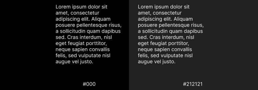
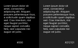
By pure color we refer to those colors that do not have any mixture of grays in their constitution, that is, when they are at their maximum saturation, such as white(#fff) or black(#000).
According to recent studies it has been found that the difference in contrast between them can cause visual fatigue, and as designers we should try to reduce this damage as much as possible.

As much as these colors generate a lot of contrast between them and visually we may think it is correct, white has a 100% brightness level and black 0%, this difference makes the eyes have to work harder to adapt to the contrast and after long periods in front of the computer can generate tension in our eyes and can overstimulate our eyesight.

So, what should we do?

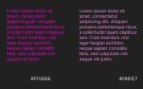
Instead of using white on black or the opposite, it is recommended to use color variants that do not reach the tone, i.e. instead of using pure black(#000) for the background we can use a shade of dark gray such as (#121212), and instead of using pure white(#fff) for the text we can use a shade of light gray(#ececec).

Not only should we be careful with these two colors, using too saturated tones on top of too dark tones can also generate conflict, so we must always make sure that the colors are not too "neon" or "fluorescent".

This will ensure that the contrast is not too high and that the user can spend more time in front of the screen.

Balanced contrast better than high contrast

Obviously we know that having a high contrast between the colors on your page improves readability and accessibility, but we have also seen that having too much contrast in the end can cause all the problems we are trying to avoid.

So we must always maintain the balance between the tones and whenever we have any doubt we can check it in some contrast corrector such as Contrast Checker - WebAIM.

I hope you found it useful!

 
by Laura Celis Ballesta Date: 12-05-2023 css hits : 880  


Related Posts

New graphic window units - CSS

''Intercop 2022' is a project announced by Google, Microsoft, Apple and the Mozzilla Foundation to make all browsers offer the same web experience. The project has 15 focus areas and one…

Let's create a Color Picker from scratch with HTML5 Canvas, Javascript and CSS3

HTML5 Canvas is a technology that allows developers to generate real-time graphics and animations using JavaScript. It provides a blank canvas on which graphical elements, such as lines, shapes, images…

How to make your own custom cursor for your website

When I started browsing different and original websites to learn from them, one of the first things that caught my attention was that some of them had their own cursors,…

Nesting: future proofing CSS

Although not currently supported by browsers, there is a proposal for CSS nesting to support a feature that would provide better readability to native CSS, so in the future it…

Use the SRCSET attribute to improve your SEO

There is a new standard HTML attribute that can be used in conjunction with IMG called SRCSET. It is new and important as it allows webmasters to display different images…

Starting with Bootstrap-Vue step by step

Today we will show you how to use BootstrapVue, describe the installation process and show basic functionality. The project’s based on the world's most popular CSS framework - Bootstrap, for building…

Bootstrap 5 beta2. What offers?

Since the release of the Bootstrap 4 is three years, in this article we will present what is new in the world’s most popular framework for building responsive, mobile-first sites.…

Creating simple CSS spinner-loader

In today's article we will show you how to animate a basic loader that spins when some predefined action is defined, such as loading an image. That can be used…

How to use Parallax.js effect on your website

Today, we're going to write about the parallax effect, similar to parallax scrolling, and how to implement it to improve your landing page. In webdev, they say mobile first -…

How to make the website's dark mode persistent with Local Storage, CSS and JS

Recently we wrote about how to do a switchable alternative color mode or theme, a very useful and popular feature to websites. Today’s article is going to be about how…

The easiest way to align items using flexbox

With the release of flexbox in CSS, it has become an essential tool when placing elements next to each other, since, by default, the children of a display: flexare stacked…

Dark Mode on website using CSS and JavaScript

In today’s article we are going to learn how to build pretty much standard these days on the web pages and that is the alternative color mode and switching between…

Clicky