Today, we're going to write about the parallax effect, similar to parallax scrolling, and how to implement it to improve your landing page. In webdev, they say mobile first - well, this engine will react to the movement of a smart device, offsetting layers depending on their depth within a scene.
First impressions are very important especially when you want to obtain a new audience.
And it's increasingly more important to have an amazing welcome page to make that ‘wow’ effect to the visitor, to make him/her get hooked. Additionally, with Parallax.js we can make use of the gyroscope in mobile devices to show the movement instantly. That's right, it will react to the orientation of a mobile phone and tablets with gyro.
Let's get into it.
First about the effect
Parallax scrolling as a web design effect is pretty much a known trend or technique to the background moving simulation. Since HTML5 and CSS3 were introduced, it became quite popular with web designers.
The object in the foreground like the text content on your site is moving at a different speed than the background image. Thus by scrolling up and down we create the illusion of the ‘depth’ as the content is in different layers. This is called a layer method. Layers that move more quickly are perceived to be closer to the virtual camera.
Note that some mobile devices do not support parallax scrolling, in that case the media queries are used to turn off the effect however.
If you want to read more about the phenomenon itself here's a link to wikipedia, let's focus on the practical use of it.
What is Parallax JS?
There are many online resources for parallax tutorials, in this article we will explain the use of Parallax.Js
It's the project of two gentlemen, Matthew Wagerfield and Claudio Guglieri, their parallax engine reacts to the orientation of a smart device.
Where no gyroscope or motion detection hardware is available, like on the classic browsers, the position of the cursor is used instead.
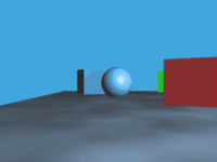
We create a simple page, for the purpose of implementing this feature on it. In our case we create a website presenting our good friend, a local artist who is making handmade balloons. This will serve our purpose, because we can use the balloons for our scene.
Code step by step:
1. Installation
Add <script src="https://cdnjs.cloudflare.com/ajax/libs/parallax/3.1.0/parallax.min.js"></script>
to your <head>
.
This is the last version. Note it’s uglyfied minified. If you like the .zip version more, you need to download it and include the link like you see bellow in your code.
<script src="path/to/parallax.js"></script>
2. Create HTML elements
We need a container element, we chose <div id=”parallax”>
, inside we will put all child elements we want, for all the objects that would become moving parts, the layers. Each layer needs a data-depth attribute, for the movement will be multiplied by the number set.
<section class="main"> <div class="scene"> <!--all child elements will become moving objects, the layers--> <div class="parallax" id='parallax'>
This is CSS code to it. We added a linear gradient to the background image, to make it a bit darker at the bottom.
.scene { position: absolute; width: 100%; height: 70%; top: 20vh; left: 0; min-height: 360px; } .parallax { position: relative; overflow: hidden; height: 100%; width: 100%; } .parallax:after { content: ""; position: absolute; bottom: 0; width: 100%; height: 100%; background: linear-gradient(rgba(0, 0, 0, 0) 0%, rgba(0, 0, 0, 0.2) 90%); }
3. Run JS instance
As we have our content ready, create Parallax.js instance, providing your scene element as first parameter.
The element should be the one directly ‘above’ those elements you want to be in parallax.
let ourParallax = document.getElementById('parallax'); let parallaxInstance = new Parallax(ourParallax);
4. Configuration
First we add our background image. It's placed inside ‘parallax’ div. About data-depth, the value has meaning of the ‘depth vision’, basically 0 is no parallax and 1 is the top value, the element with data-depth=”1”
will move the most. This value should be used to set your scene so that the objects in the foreground have this value set near 1 and the objects in the background have the minimal value.
<section class="main"> <div class="scene"> <!--all child elements will become moving objects, the layers--> <div class="parallax" id='parallax'> <!--Background, also in parallax→ <div class="parallaxBackground" data-depth="0.1"></div>
CSS code:
.parallaxBackground { position: absolute; width: 110vw; height: 75vh; top: -5% !important; left: -5% !important; background: url("../images/BG.jpg") 50% 100% / cover no-repeat; }
Note that this framework overrides the values for positioning of our elements on the screen, to have it as we want, for that we use !important parameter to increase specificity.
So far so good! We have until now this:
5. Adding more pictures!
Now we have prepared some more pictures - clouds and balloons for our scene. The URLs for those are linked in the <span>
, look at CSS code. Likewise the cathedral picture. All images have a transparent background, or you can use .svg vector images if you like.
<div class="parallax" id='parallax'> <div class="parallaxBackground" data-depth="0.1"></div> <div class="clouds parallaxCloud1" data-depth="0.15"><span></span></div> <div class="clouds parallaxCloud2" data-depth="0.3"><span></span></div> <div class="clouds parallaxCloud3" data-depth="0.25"><span></span></div> <div class="clouds parallaxCloud4" data-depth="0.23"><span></span></div> <div class="clouds parallaxCloud5" data-depth="0.29"><span></span></div> <div class="balloons parallaxBalloon1" data-depth="0.4"><span class="anim1"></span></div> <div class="balloons parallaxBalloon2" data-depth="0.6"><span class="anim2"></span></div> <div class="balloons parallaxBalloon3" data-depth="0.7"><span class="anim1"></span></div> <div class="baloons parallaxBaloon4" data-depth="0.9"><span class="anim3"></span></div> <div class="parallaxCathedral" data-depth="0.35"><span></span><div>
CSS, only one element is shown, to not overwhelm nobody with too much code.
.clouds { position: absolute; width: 0; height: 0; } .clouds span { position: absolute; display: inline-block; } .parallaxCloud1 { top: -1% !important; /* or in vh vw */ left: -1% !important; } .parallaxCloud1 span { width: 225px; height: 82px; background: url("../images/cloud1.png") 0 0 / 100% no-repeat; }
The balloons are animated to move up and down 4% infinitely, you can have for example for each element its own animation.
.balloons { position: absolute; display: inline-block; transform-origin: 50%; } .balloons span { position: absolute; display: inline-block; transform-origin: 50%; } .anim1 { animation: float 5s infinite ease-in-out; } @keyframes float {0% {transform: translateY(0%); } 50% {transform: translateY(4%); } 100% {transform: translateY(0%); } } .parallaxBalloon1 { top: 8% !important; left: 12% !important; } .parallaxBalloon1 span { width: 94px; height: 140px; background: url("../images/balloonLove.png") 0 0 / 100% no-repeat; }
WOW. Radical
So, now we have something like this. We know it's kind of hard to see the motion in a still article, but you can visit the page we constructed to see it working.
There is also a demo of the engine at http://matthew.wagerfield.com/parallax/.
Hopefully we demonstrated the possibilities as there are surely occasions when this technique might come handy to fill that artistic feel you might need in your website.
Conclusion
This wraps up the article, there are many options how to use parallax effect to make your website look much more interesting for the user or just a random visitor.
If you want to know more about the uses of parallax effect in practice, we wrote about the examples in this article:
https://www.ma-no.org/en/programming/javascript/16-fantastic-examples-and-uses-of-the-parallax-effect