8 Lessons in Mobile Usability Testing

8 Lessons in Mobile Usability Testing
by Janeth Kent Date: 30-05-2013 mobile usability

Mobile web browsing is expected to turn into the next major Internet platform.

Designing for mobile devices needs to be simpler than its standard website and more task-based to get the job done because users look for something specific and urgent.

To aid you in creating website that is accessible not just on desktop or laptop computers but also mobile devices, here are some 8 things to consider on mobile web design .

1. Decide On The Screen Resolution

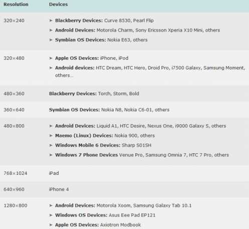
Here is a list of web resolutions popular on mobile devices presented by Uxbooth.com with their published article, Considerations for Mobile Web Design (Part 2): Dimensions, by David Leggett. The author explains a few points about display dimensions and solutions for layout design.

2. Keeping Everything to a Minimum

KEM (Keeping Everything to a Minimum). Make sure your navigation bar is as short as it can be: eliminate excessive hyper-links, keep the use of images to a minimum. Less is definitely More.

3. Break Up Web Pages Into Small Portions

Long sections of text can be hard to read so placing them on several pages limits the scrolling to one direction. Get rid of low priority content. Stick to a single column of text that wraps so there’s no horizontal scrolling.

4. Simplify The Design: Communicating Through Color

Simplicity equates to usability. Let them move around the site with no difficulty. Avoid the inclusion of tables, frames and other formatting.

Color plays a large role in a mobile websites usability. When color is used within the right parameters, it gives way to a more visually compelling manner for us to communicate information on a page without having to use up any additional space. If you decide to use different colors, make sure you refer to the W3C Mobile Web Best Practice (Use Of Color).

5. Give the Option To View The Full Website

Provide a link for your mobile visitors to switch back to your full website for the user to find and view the other content and features that’s only accessible to the desktop version of the site.

6. Balance Links

Each page download consumes time and system resources, the latter of which are in short supply, so try not to force the site visitor to digg through a multitude of pages in order to access the information sought. Strike a balance between the number of links on each page and the depth of the site.

7. No Pop ups Or Refreshes

Mobile browsers do not normally support pop-ups. And if they did, they’d have very narrow space to pop into. Also, don’t have pages refreshing periodically to avoid filling the device limited memory. Let the user refresh the content.

8. Testing Phase

The development of effective usability within your mobile website will require you test early on in the design process. Remember to keep tests as simple as possible. Testing for usability is not a one-time event. This will help you increase the quality of your mobile website through time. 


by Janeth Kent Date: 30-05-2013 mobile usability hits : 4407  
 
Janeth Kent

Janeth Kent

Licenciada en Bellas Artes y programadora por pasión. Cuando tengo un rato retoco fotos, edito vídeos y diseño cosas. El resto del tiempo escribo en MA-NO WEB DESIGN AND DEVELOPMENT.


Related Posts

Android Hidden Codes: unveiling custom dialer codes and their functionality

In the world of Android smartphones, there exist numerous hidden codes that can unlock a treasure trove of functionalities and features. These codes, known as custom dialer codes, provide access…

Secret iPhone codes to unlock hidden features

We love that our devices have hidden features. It's fun to learn something new about the technology we use every day, to discover those little features that aren't advertised by the…

How to set up your Android phone: learn how to get your new phone up and running

If you've just bought a great new Android phone, you'll want to start using it as soon as possible. You'll see that it's not hard to get the initial set-up and…

How to setup an Android TV with androidtv.com/setup or the Google application

Android TVs and players are a good investment if you want to have all the entertainment at your fingertips. However, they require an installation that, although simple, has several ways…

How to turn your smartphone into a webcam for your pc

With the propagation of Covid-19 we all had to adapt to a new quarantine situation at home, and since the human being needs to communicate constantly, we used the internet…

5 Fool-Proof Ideas For Location-Based Apps

Like it or not, geolocation is a part of our everyday lives. In fact, you’ll find the technology pre-installed on 90% of the apps currently living on your smartphone. Location-based…

Is Old School RuneScape Still Popular?

Since the launch of RuneScape 3 there are two versions of RuneScape running simultaneously: RuneScape 3 and Old School RuneScape. At first glance it seems that having two iterations of…

How to disable the camera, microphone and all sensors on your phone with a single touch in Android 10

With Android 10, Google has improved the privacy of its operating system with new options, but has also hidden an interesting option that deactivates all the sensors of the device…

Progressive Web Apps Directory: The Best Collection of Resources

Get started with progressive web apps and learn things in depth, this page will list the best resources we know of to help you understand Progressive Web Apps (PWAs) . Make…

Unlock Hidden SmartPhone Features with these Secret Codes

Unstructured Supplementary Service Data (USSD), sometimes known as "quick codes" or "feature codes", is an extra-UI protocol, which allows people to access hidden features. This protocol was originally created for…

The Rise and Fall of Business-Related VoIP Platforms

Voice over Internet protocol (VoIP) was at one time ubiquitous within the office environment. It had been employed to make crystal-clear digital phone calls, to send large packets of proprietary…

The 5 biggest web trends of the year

Bowenmedia wants to suggest us  the biggest web design trends of 2015. The following infographic highlights the main web design trends that differentiate a modern site from an older design.  1. Mobile focus Mobile…

Clicky