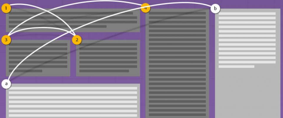
CSS Regions allow content to flow across multiple areas called regions.
With CSS Regions you can separate the content from the layout therefore you can create responsive content very easily.
Let's see how.
flow-into and flow-from
The flow-into CSS property can be used to prevent some content from displaying normally, but rather have its display redirected to a named flow:
#source {

 -webkit-flow-into: main-thread;

flow-into: main-thread;

}
Then you can specify the layout, and tell it where to get its content from using theflow-from CSS property:
.region {

 -webkit-flow-from: main-thread;

flow-from: main-thread;

}
Note that all of the content in the element with ID source will actually get rendered into the layout specified by all of the elements of class region.
Example
Let’s take a look at an example.
First of all, make sure you are using this with either a Webkit nightly, Chrome Canary or an up-to-date Chrome browser. Then, enable CSS regions by navigating to chrome://flags and clicking on “Enable” under Enable experimental Webkit features.
HTML
<div class="region"></div>

<img src="https://media.ma-no.org/imgr/1000-600/admin-php.jpg">

<div class="region"></div>

<div class="region"></div>

<div class="region"></div>

<div class="region"></div>

<div class="region"></div>

<div class="region"></div>

<div id="source">

Far far away, behind the word mountains, far from the countries Vokalia and
Consonantia, there live the blind texts. Separated they live in
Bookmarksgrove right at the coast of the Semantics, a large language
ocean. A small river named Duden flows by their place and supplies it
 with the necessary regelialia. It is a paradisematic country, in which
oasted parts of sentences fly into your mouth.
</div>
CSS
#source {

 -webkit-flow-into: main-thread;

float-into: main-thread;  }


img {

width: 200px;

float: left;

margin: 10px 5px;

}


.region {

width: 150px;

height: 150px;

float: left;

margin: 10px 5px;

-webkit-flow-from: main-thread;

flow-from: main-thread;

}
Basically, we have a div: ID issource. That div contains all of the text to be displayed, but, thanks to the CSS
#source {-webkit-flow-into: main-thread;float-into: main-thread; }
the text gets redirected into the named flow called main-thread and doesn’t display in its original div.
We also have other divs, all of class region. In the CSS we have:
.region {

width: 150px;
height: 150px;
float: left;
margin: 10px 5px;
-webkit-flow-from: main-thread;
flow-from: main-thread;
}
Those regions will get their content from the main-thread named flow.
The divs will automatically re-layout as you adjust the width of the window.
Finally,we stuck an image in the middle to show that the regions can be easily interspersed with other content.
You can find out more about CSS Regions here.
This article was inspired by http://blattchat.com/2013/08/16/responsive-text-using-css-regions/

