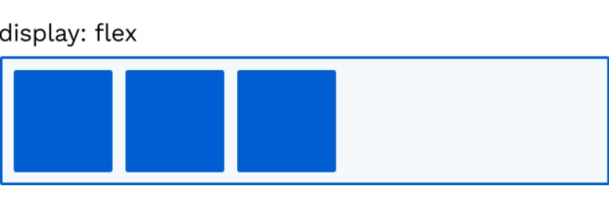
With the release of flexbox in CSS, it has become an essential tool when placing elements next to each other, since, by default, the children of a display: flex are stacked on the left side taking up the minimum space according to their content.
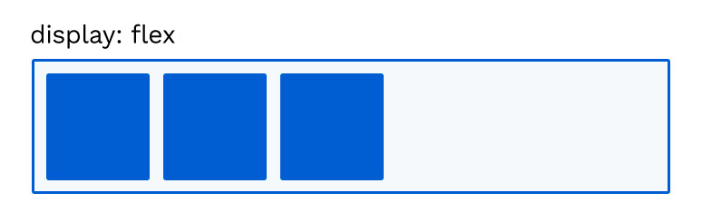
If we want to modify the behavior of the children, making them distributed throughout the available space, for example, you can use the properties associated with Flex called justify-content..
If we want to modify the behavior on the vertical axis you can use align-items .
There are also other properties that we can apply to the children and modify their default behavior.
But in CSS there are many ways to achieve the same result, and usually the best option is the simplest.
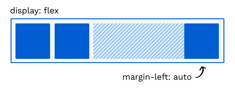
Well, I'll show you a super simple way: I use to align elements within a container with display: flex and is using margin:auto.
Display: flex + Margin: auto
If we apply an automatic margin to an element within a 'flex' it will push it in the opposite direction, as shown in the following image:
But this not only works in the X-axis, we can also use it to align in the Y-axis
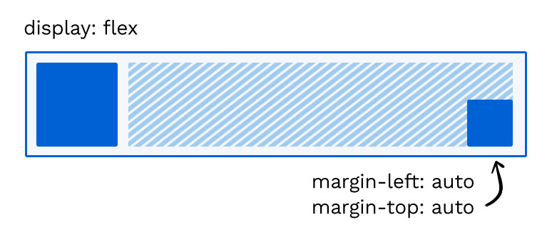
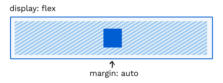
And if you have come this far, surely you will not be surprised when you see that to center all the axes you only need a container with flex display and auto margin for the child, remember that for this to work the parent element has to have height.
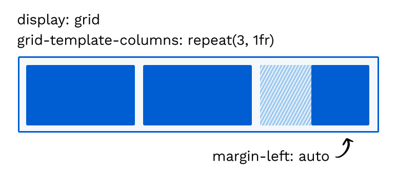
Margin-auto within a grid
This behavior also happens inside a display:grid with the difference that the children have a delimited space, in the following image you can see the result:
TRY THE CODE
THE CSS
.flex {
display: flex;
}
.cell {
  width: 50px;
  height: 50px;
  border-radius: 2px;
  background-color: #317cd8;

  &:not(:last-child) {
  margin-right: 6px;
  }
  }
.row-decoration {
  padding: 6px;
  border: 2px solid #317cd8;
  border-radius: 1px;
  margin-bottom: 6px;
  }
section {
  max-width: 680px;
  margin: auto;
  }