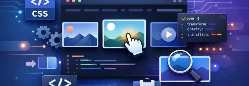
In the past, we’ve wrote about some awesome examples of CSS effects that were easy to copy and paste right into your code.
Today, we’re going to follow that up with ten new effects specifically built for use with images. Each example comes with an HTML and CSS snippet.
1. Sneak Peek
Before we begin creating the individual demos, some basic setup is required. Here’s a chunk of CSS that we’ll be using to dictate the basic appearance of all of the examples.
  -webkit-box-sizing: border-box;

	     -moz-box-sizing: border-box;

	      -ms-box-sizing: border-box;

	          box-sizing: border-box;

	}


	body {

	  background: #333;

	}


	.pic {

	  border: 10px solid #fff;

	  float: left;

	  height: 300px;

	  width: 300px;

	  margin: 20px;

	  overflow: hidden;


	  -webkit-box-shadow: 5px 5px 5px #111;

	          box-shadow: 5px 5px 5px #111;

	}
Box-sizing allows you to manipulate the box model, and the pic class gives us a place to toss in some generic styling for each photo.
2. Zoom and Pan
The first group of effects involves utilizing some tricks with hidden overflow. By clipping the image to the bounds of a div, we can pull off some pretty cool hovers.
To begin, we’ll make it so that when the user hovers over the image, the photo enlarges while still staying within its bounds, resulting in a zooming in effect. Here’s the HTML.
HTML
http://yoururl.com/assets/img" alt="portrait">
Now let’s see the CSS.
/*GROW*/

	.grow img {

	  height: 300px;

	  width: 300px;


	  -webkit-transition: all 1s ease;

	     -moz-transition: all 1s ease;

	       -o-transition: all 1s ease;

	      -ms-transition: all 1s ease;

	          transition: all 1s ease;

	}


	.grow img:hover {

	  width: 400px;

	  height: 400px;

	}
3. Shrink
We’ve seen how to grow an image on hover, so let’s reverse that effect and zoom the photo out. The method is pretty much exactly the same, only this time you’ll start with the size at 400px and shrink it to 300px on hover.
HTML
http://yoururl.com/assets/img" alt="city">
CSS
/*SHRINK*/

	.shrink img {

	  height: 400px;

	  width: 400px;


	  -webkit-transition: all 1s ease;

	     -moz-transition: all 1s ease;

	       -o-transition: all 1s ease;

	      -ms-transition: all 1s ease;

	          transition: all 1s ease;

	}


	.shrink img:hover {

	  width: 300px;

	  height: 300px;

	}
4. Side Pan
The next effect keeps the image the same size throughout, but pans it sideways as the user hovers.
CSS
http://yoururl.com/assets/img" alt="kick">
HTML
/*SIDEPAN*/

	.sidepan img {

	margin-left: 0px;

	-webkit-transition: margin 1s ease;

	-moz-transition: margin 1s ease;

	-o-transition: margin 1s ease;

	-ms-transition: margin 1s ease;

	transition: margin 1s ease;

	}


	.sidepan img:hover {

	margin-left: -200px;

	}
For the pan, we're not changing the image size like we did last time, but instead using margin to pull the image left on hover. If you want it to move right, use a positive value or margin-right.
5. Vertical Pan
We use this effect to convey a sense of motion, but this is also great for communicating height if you want to pan up something like a tall building.
CSS
http://yoururl.com/assets/img" alt="climb">
HTML
/*VERTPAN*/

	.vertpan img {

	  margin-top: 0px;

	  -webkit-transition: margin 1s ease;

	     -moz-transition: margin 1s ease;

	       -o-transition: margin 1s ease;

	      -ms-transition: margin 1s ease;

	          transition: margin 1s ease;

	}


	.vertpan img:hover {

	  margin-top: -200px;

	}
6. Tilt
This one is super simple, all we're going to do is rotate the image slightly when the user hovers over it. The result is a basic but fun illusion of a crooked hanging picture.
HTML
http://yoururl.com/assets/img" alt="car">
CSS
/*TILT*/

	.tilt {

	  -webkit-transition: all 0.5s ease;

	     -moz-transition: all 0.5s ease;

	       -o-transition: all 0.5s ease;

	      -ms-transition: all 0.5s ease;

	          transition: all 0.5s ease;

	}


	.tilt:hover {

	  -webkit-transform: rotate(-10deg);

	     -moz-transform: rotate(-10deg);

	       -o-transform: rotate(-10deg);

	      -ms-transform: rotate(-10deg);

	          transform: rotate(-10deg);

	}
7. Morph
When the user hovers, the image begins to spin. As it spins, it morphs from a square into a circle. The result is super fun to play with.
HTML
 http://yoururl.com/assets/img" alt="beach">
CSS
/*MORPH*/

	.morph {

	  -webkit-transition: all 0.5s ease;

	     -moz-transition: all 0.5s ease;

	       -o-transition: all 0.5s ease;

	      -ms-transition: all 0.5s ease;

	          transition: all 0.5s ease;

	}


	.morph:hover {

	  border-radius: 50%;

	  -webkit-transform: rotate(360deg);

	     -moz-transform: rotate(360deg);

	       -o-transform: rotate(360deg);

	      -ms-transform: rotate(360deg);

	          transform: rotate(360deg);

	}
What I’ve done here is set the morph class to spin 360 degrees on hover. As it’s spinning, the border-radius will gradually climb its way to 50%, resulting in a circle.
8. Focus
Here’s another effect that uses border-radius to round off the image. This time, we’ll not only increase the border’s radius but also its thickness. Combined with the border-box, this will create an effect that focuses in on on particular part of an image.
HTML
http://yoururl.com/assets/img" alt="cricket">
CSS
/*FOCUS*/

	.focus {

	  -webkit-transition: all 1s ease;

	     -moz-transition: all 1s ease;

	       -o-transition: all 1s ease;

	      -ms-transition: all 1s ease;

	          transition: all 1s ease;

	}


	.focus:hover {

	  border: 70px solid #000;

	  border-radius: 50%;

	}
What I did here was take our 10px white border and turned it into a 70px black border while cranking the radius up to 50% like we did in the last example.
Webkit Filters
This last set of effects is purely experimental. Unlike the examples above, all of which use multiple prefixes to ensure maximum browser compatibility, these only use the -webkit prefix because there’s no other support at the moment. If you’re not using Safari or Chrome, these aren’t going to work for you.
Despite the unfortunate constraints, Webkit filters let you perform some pretty awesome effects! Here’s a demo of three of my favorites:
9. Blur
The first effect that we’re going for is a simple blur.
HTML
CSS
/*BLUR*/

	.blur img {

	  -webkit-transition: all 1s ease;

	     -moz-transition: all 1s ease;

	       -o-transition: all 1s ease;

	      -ms-transition: all 1s ease;

	          transition: all 1s ease;

	}


	.blur img:hover {

	  -webkit-filter: blur(5px);

	}
AS you can see, we use the -webkit-filter property, then set the blur to 5px.
10. B&W
This time we’re going to drop all of the saturation out of the image on hover. It used to take two images to pull off this effect but with Webkit filters, we can cut this down to one.
HTML
CSS
/*B&W*/

	.bw {

	  -webkit-transition: all 1s ease;

	     -moz-transition: all 1s ease;

	       -o-transition: all 1s ease;

	      -ms-transition: all 1s ease;

	          transition: all 1s ease;

	}


	.bw:hover {

	  -webkit-filter: grayscale(100%);

	}
11. Brighten
For our final trick, we’re going to darken a photo by default, then brighten it up to its normal state on hover. This creates a sort of reveal effect.
/*DARKEN*/

	.brighten img {

	  -webkit-filter: brightness(-65%);

	  -webkit-transition: all 1s ease;

	     -moz-transition: all 1s ease;

	       -o-transition: all 1s ease;

	      -ms-transition: all 1s ease;

	          transition: all 1s ease;

	}


	.brighten img:hover {

	  -webkit-filter: brightness(0%);

	}
Here, 0% is regular brightness. Anything above that and you brighten the image, anything below and you darken it. We started at -65% and brought it up to 0% on hover.