
Whether it is a signup flow, a multi-view stepper, or a monotonous data entry interface, forms are one of the most important components of digital product design. This article focuses on the common dos and don’ts of form design. Keep in mind that these are general guideline and there are exceptions to every rule.
Forms should be one column
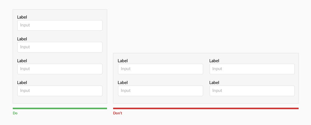
Multiple columns disrupt a users vertical momentum.
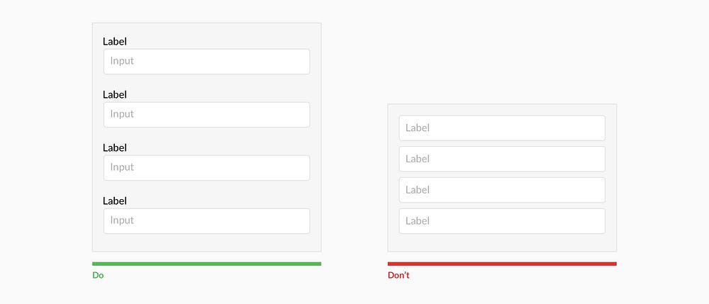
Top align labels
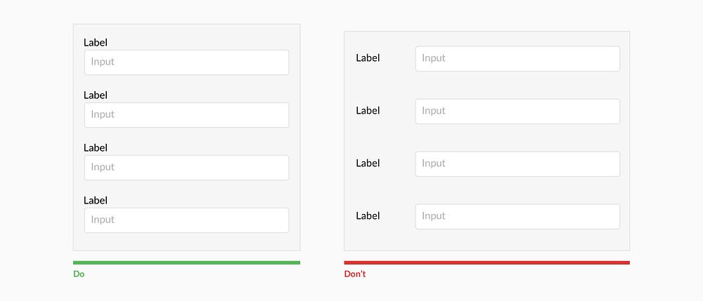
Users complete top aligned labeled forms at a much higher rate than left aligned labels. Top aligned labels also translate well on mobile. However, consider using left aligned labels for large data-set entry with variable optionality because they are easier to scan together, they reduce height, and prompt more consideration than top aligned labels.
Group labels with their inputs

Present the label and input close together, and make sure there is enough height between the fields so users don’t get confused.
Avoid all caps
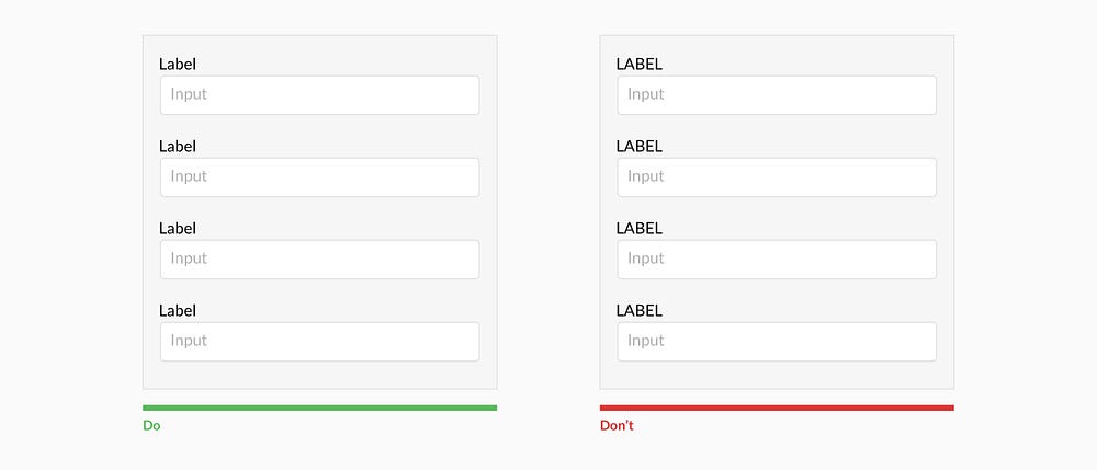
All caps is more difficult to read and scan.
Show all selection options if under 6
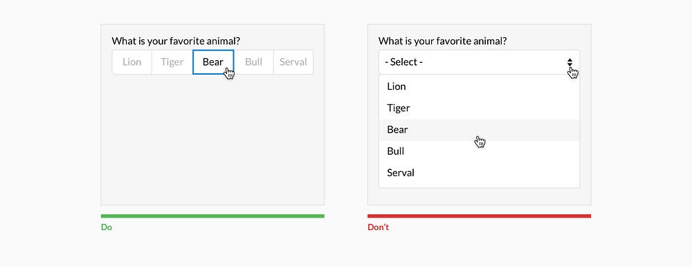
Placing options in a selector drop-down requires two clicks, and hides the options. Use an input selector if there are over 5 options. Incorporate contextual search within the drop-down if there are over 25 options.
Resist using placeholder text as labels
It is tempting to optimize space by using placeholder text as labels. This causes many usability issues that have been summarized by Katie Sherwin of Nielsen Norman Group.
Place checkboxes (and radios) underneath each other for scannability
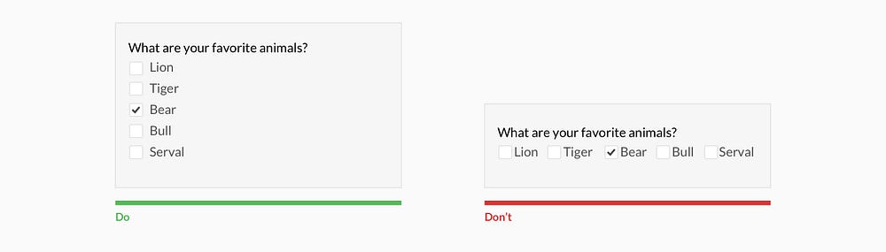
Placing checkboxes underneath each other allows easy scanning.
Make CTAs descriptive
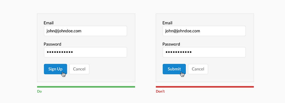
A call to action should state the intent.
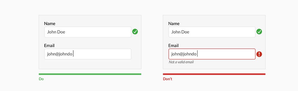
Specify errors inline
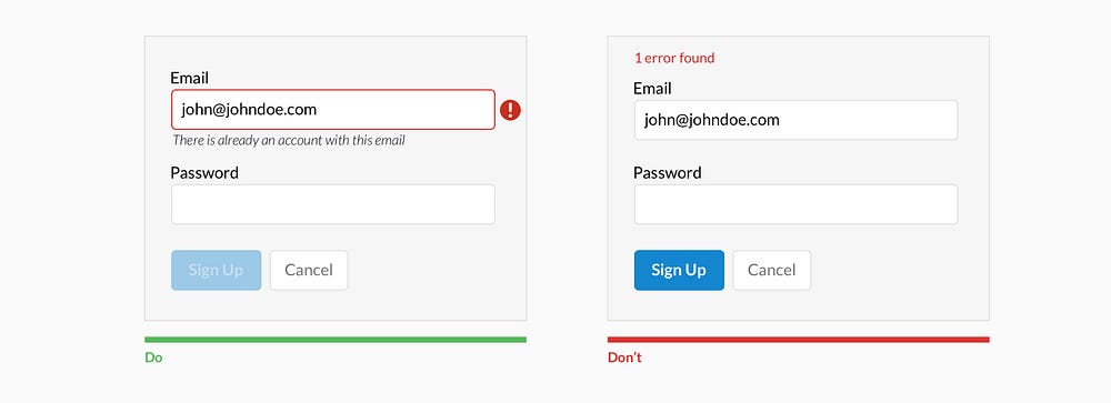
Show the user where the error occurred and provide a reason.
Use inline validation after the user fills out the field (unless it helps them while in the process)
Don’t use inline validation while the user is typing — unless it helps them — like in the case of creating a password, username, or message with a character count.
Don’t hide basic helper text
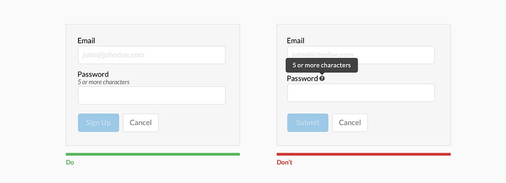
Expose basic helper text wherever possible. For complex helper text, consider placing it next to the input during its focused state.
Differentiate primary from secondary actions
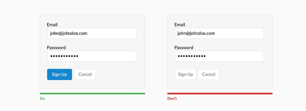
There is a bigger philosophical debate regarding whether a secondary option should even be included.
Use field length as an affordance
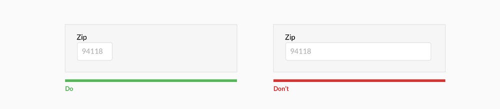
The length of the field affords the length the answer. Employ this for fields that have a defined character count like phone numbers, zip codes, etc.
Ditch the * and denote optional fields
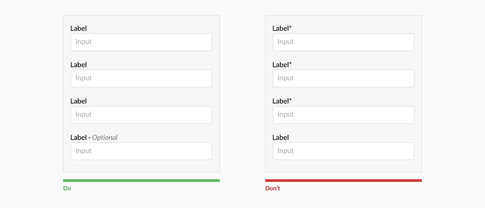
Users don’t always know what is implied by the required field marker (*). Instead, it is better to denote optional fields.
Group related information
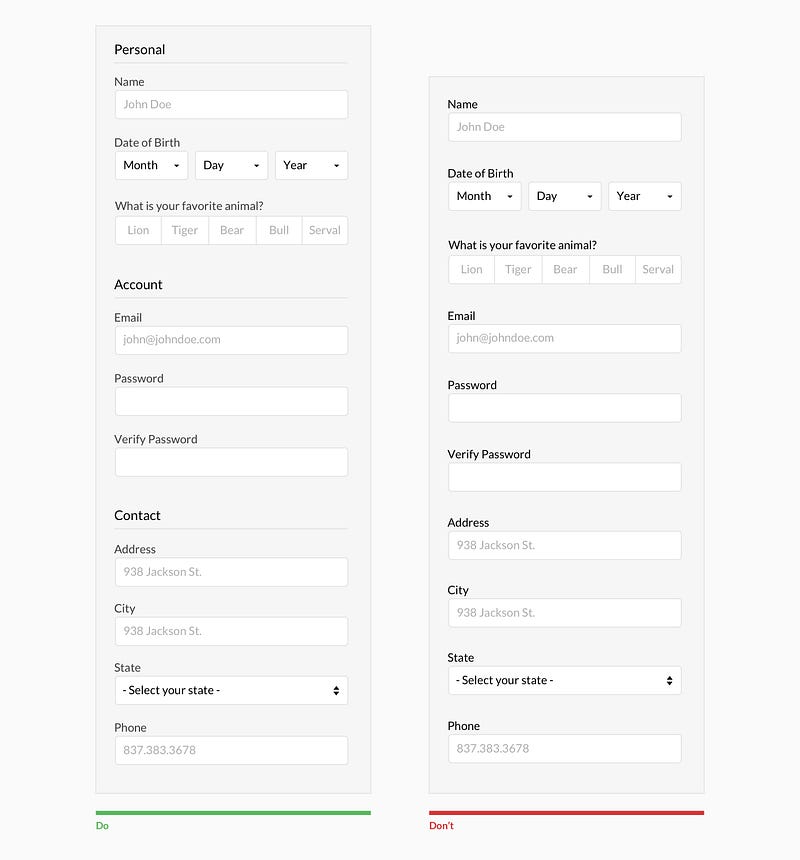
Users think in batches, and long forms can feel overwhelming. By creating logical groups the user will make sense of the form much faster.
Why ask?
Omit optional fields and think of other ways to collect data. Always ask yourself if the question can be inferred, postponed, or completely excluded.
Data entry is increasingly automated. For example, mobile and wearable devices collect large amounts of data without the user’s conscious awareness. Think of ways you can leverage social, conversational UI, SMS, email, voice, OCR, location, fingerprint, biometric, etc.
Make it fun
Life is short. No one wants to fill out a form. Be conversational. Be funny. Gradually engage. Do the unexpected. It is the role of the designer to express their company’s brand to elicit an emotional reaction. If done correctly, it will increase completion rates. Just make sure you don’t violate the rules listed above.
Design vector created by freepik - www.freepik.com