
This area, which arises from a basic human need, such as the urge to communicate, is constantly changing thanks to the advances of the technological era. Today, we invite you to reflect on the origin of this discipline and its future challenges.
Graphic language has always been present throughout our lives as a way of representing reality. We've seen this ever since the caveman started painting the cave walls. His drawings were mostly hunting images made with materials such as charcoal, resin, blood and plants. While they used their hands or reeds as a tool to apply them on the wall.
We also see it in the ancient Egyptian hieroglyphs, which were graphic representations of everyday life. For this, they used clay as a support and bamboo canes to make the incisions. However, graphic language takes on a more abstract meaning. In other words, the meaning and the signifier are not equivalent.
A Look Into The Future Of Web Design
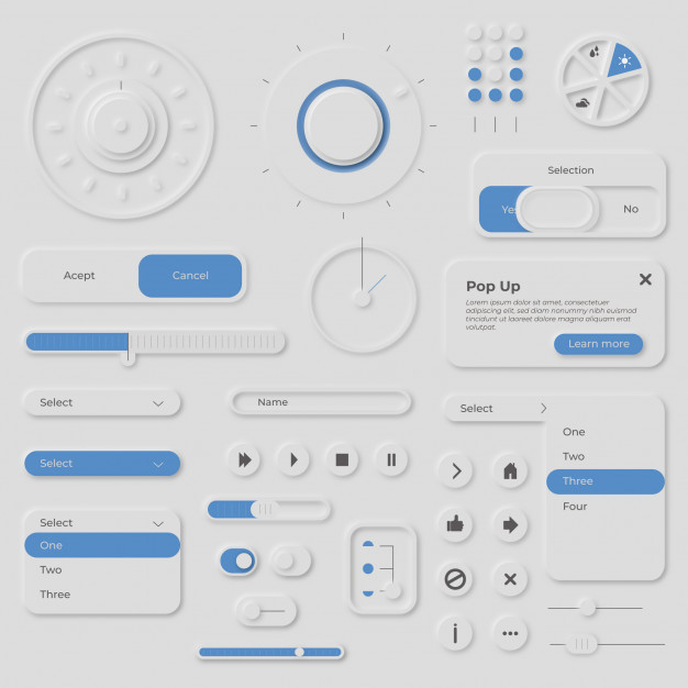
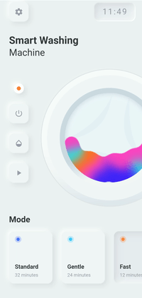
If you're a designer and have been looking for references for your next projects on sites like Dribbble, Behance or blogs, chances are you've come across many interfaces that look like this:
Sober backgrounds, borderless shapes and the use of shadows and lights are the main characteristics of this trend. Its presence has become especially popular in interface design, both desktop and mobile.
We're talking about Neomorphism
This style began to be built with the aim of giving the user elements of a graphic interface that resemble everyday objects in reality. That is, it is a new form of graphic representation of reality for digital media.
Where does neomorphism come from?
The term Neomorphism is the combination of the word New and the term Skeumorphism, coined by Steve Jobs to describe the "traditional" look of its interfaces in the first versions of Iphone, how to forget these interfaces!
Following the second principle of Nielsen Heuristics, this trend tries to imitate as closely as possible the objects and artifacts we interact with in real life. This was reflected in tools such as the calculator, iBook and its book case or the notepad app, which obviously looked like a notepad.
While this aesthetic proved effective in a period where the transition from analog was just beginning, today users are already accustomed to having a digital interface.
Therefore, it is no longer necessary to resemble the objects of reality, but it is enough that they evoke the same sensation.
Interfaces such as those of Google and Apple, currently have a much flatter and more sober design, where the use of floating figures stands out.
The good and the bad
This form of graphic representation stands out for being sober and clean. So it's easy to create an appropriate contrast to highlight elements that we want our users to see first. Calls to Action (CTA) or some more relevant content are examples of this. It is also characterized by a more timeless and long-lasting aesthetic. The latter being one of the principles of good design according to German designer Dieter Rams.
While its sober appearance is very tempting, it can be a double-edged sword. According to the law of pragnanz, people tend to identify objects with simple shapes more easily. In this case, figures such as squares or circles do not have an edge line separating them from the background. Its "limit" is built on the play of light and shadow. This can result in people with visual perception problems not being able to identify them well.
The questionable
It must always be assessed whether the style in question is appropriate for the content I am offering. In the particular case of neo-morphism, it may be that sobriety and cleanliness stand out over what I want to communicate in words. It's okay to worry about how I offer my contents, but you have to remember that they have to be easy to read. Robert Bringhurst, poet, typographer and writer, explains in his book "The Elements of Typographic Style":
"The satisfactions of the trade come from clarifying and perhaps even ennobling the text, not from deceiving the unsuspecting reader by the use of perfumes, paints, and iron brassieres applied to empty prose."
Graphic design has always been present in our lives and our daily work. It has evolved with us and helped us to communicate effectively. Contrary to what many might think, it is not just about making objects, images or interfaces more beautiful or "aesthetic".
Its objective is to democratize and transmit a message in a visual way so that it can be read and understood better in a specific context.
Neo-morphism, like the Isthmus of Art History and the origin of design as a discipline, is part of the constant iteration of understanding, projecting and remaking our environment in order to create unique experiences.
Images: