
In order to serve mobile-optimized content, you need to detect which visitors are coming from mobile devices and which aren’t.
Here we have list 8 method to detect mobile browsers so you can chose the best suitable to your needs, and give your user the best experience possible.
#1 PHP User Agent
We can test the user agent comparing with a list of known mobile user agents so you can redirect the user to a different version, add a new cookie, set a global variable to be used in your CMS, set a HTML class or anything else you may want to do.
The PHP code itself is quite simple.We'll use the preg_match() function to compare current browser with an array of mobile browsers:
You can disable this test, via Cookie setting a link to yoursite?nomobile=1 then you can test this var before doing the redirection part:
#2 JavaScript User Agent
The JS is more suitable for places where you have little or no control on the server side code, or you want to do something specific (like a landing page).
Moreover, the JS code is quite limited because you need to load the entire site before doing the redirection.
So, here is an example:
#3 WordPress code
WordPress actually has an internal mobile sniffing tool so you’ll have a global variable to tell you if the current user is an iPhone or not (and a few other browsers).
Here is an example:
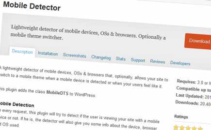
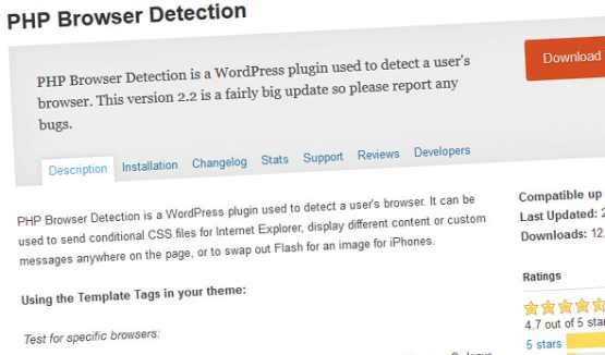
#4 WordPress Plugins
Here are some options:
#5 HTML Code for Retina
This is a simple way to be done in your
, while you’re calling your styles:
#6 Media queries
The media queries allow you to conditionally apply styles.
/* Smartphones (portrait and landscape) ----------- */
@media only screen   and (min-device-width : 320px)
and (max-device-width : 480px) {  /* Styles */  }    /*
Smartphones (landscape) ----------- */
@media only screen   and
(min-width : 321px) {  /* Styles */  }
 /* Smartphones (portrait) ----------- */
@media only screen   and (max-width : 320px)
 {  /* Styles */  }
/* iPads (portrait and landscape) ----------- */
@media only screen   and (min-device-width : 768px)
 and (max-device-width : 1024px) {  /* Styles */  }
 /* iPads (landscape) ----------- */
@media only screen   and (min-device-width : 768px)
and (max-device-width : 1024px)   and (orientation : landscape) {  /* Styles */  }
/* iPads (portrait) ----------- */
@media only screen   and (min-device-width : 768px)
and (max-device-width : 1024px)   and (orientation : portrait) {  /* Styles */  }
/* Desktops and laptops ----------- */  @media only screen   and (min-width : 1224px) {  /* Styles */  }
 /* Large screens ----------- */
@media only screen   and (min-width : 1824px) {  /* Styles */  }
/* iPhone 4 ----------- */  @media  only screen and (-webkit-min-device-pixel-ratio : 1.5),
only screen and (min-device-pixel-ratio : 1.5) {  /* Styles */  }
If you want to target only retina devices you can try:
@media only screen and (-webkit-min-device-pixel-ratio:2){ }
#7 Media Queries via JavaScript
An obscure technique perhaps...
You can test media queries using JavaScript, and if returns true, for example, you could conditionally change classes, change image src attributes, redirect your page.
#8 Htaccess code
The idea is similar to the first PHP method.
RewriteCond %{HTTP_USER_AGENT} “ipod|iphone|ipad|blackberry”[NC]
RewriteCond %{REQUEST_URI} ^/$
RewriteRule ^ http://m.yoursite.com%{REQUEST_URI} [R,L]