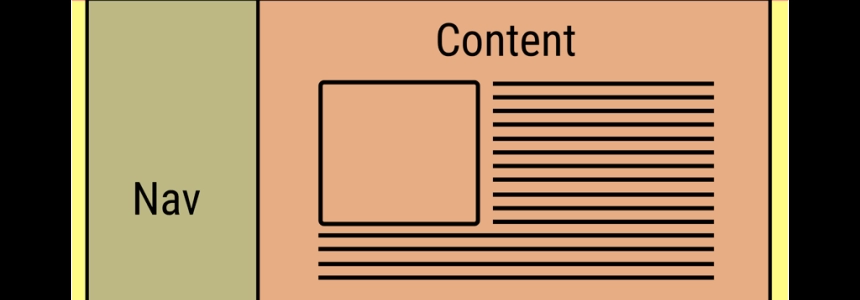
The CSS3 Flexible Box, or flexbox, is a layout mode providing for the arrangement of elements on a page such that the elements behave predictably when the page layout must accommodate different screen sizes and different display devices. For many applications, the flexible box model provides an improvement over the block model in that it does not use floats, nor do the flex container's margins collapse with the margins of its contents.
Many designers will find the flexbox model easier to use. Child elements in a flexbox can be laid out in any direction and can have flexible dimensions to adapt to the display space. Positioning child elements is thus much easier, and complex layouts can be achieved more simply and with cleaner code, as the display order of the elements is independent of their order in the source code. This independence intentionally affects only the visual rendering, leaving speech order and navigation based on the source order.
Here some useful resources:
FIBONACCI
Fibonacci is an offshoot of an internal tool created to let non-developers design page layouts using Flexbox, without having to learn HTML or CSS. Live demo here.
Fibonacci starts with a blank
After you've made your horizontal or vertical split, you can then add a new sibling, shrink or expand, give it a fixed width/height, remove or split it again. Remember to add a unit when you enter a fixed width or height! Once you're happy with the layout, hit the export icons to copy the generated code and paste it wherever you need it in your own code.
Tiny sidenote: Fibonacci is mostly a little sideproject still under development and by no means perfect or bug free. Contributions are highly welcome :)
CSS FLEXBOX PLEASE
The CSS Flexible Box Layout Model, or "flexbox", is one of the specification in CSS3. It provides for the arrangement of elements on a page such that the elements behave predictably when the page layout must accommodate different screen sizes and different display devices. For many applications, the flexible box model provides an improvement over the block model in that it does not use floats, nor do the flex container's margins collapse with the margins of its contents.
FLEXIBILITY
Flexibility is a polyfill for the Flexible Box Layout, commonly known as Flexbox. With Flexibility, you get to design beautiful, flexible layouts on the web without sacrificing the experience in older browsers.
FLEXBOX APP
Flexbox is a new CSS3 layout technology enabling developers to easily construct complex layouts. Before Flexbox, those layouts were difficult or impossible to achieve.
The Flexbox App is an interactive cheat sheet built with React. It allows you to try out all the new Flexbox attributes with instant visual feedback.
FLEX LAYOUT ATTRIBUTE
Flexbox is a new CSS3 layout technology enabling developers to easily construct complex layouts. Before Flexbox, those layouts were difficult or impossible to achieve.
The Flexbox App is an interactive cheat sheet built with React. It allows you to try out all the new Flexbox attributes with instant visual feedback.