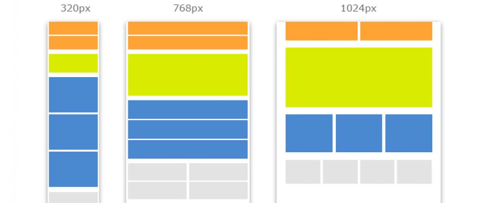
Responsive Web Design has gained huge popularity and demand over the years. With novel gadgets being developed every year it is necessary for a Web Developer to make sure that the Website they design is compatible with all the various gadgets that are in the market.
CSS3 Media Queries help you add great deal of Media Device Responsiveness to your websites.
The best thing about the Media Queries is that they not only focus on specific classes of devices or particular devices but rather they will allow you to actually examine the physical characteristics of any gadget or device.
There are a number of different media queries that you can use on your design, if you don't know where to start with media queries here is a good boilerplate to go with.
This snippet gives you a generic base for your media queries but if you want to target a specific device then you need to change these media queries.
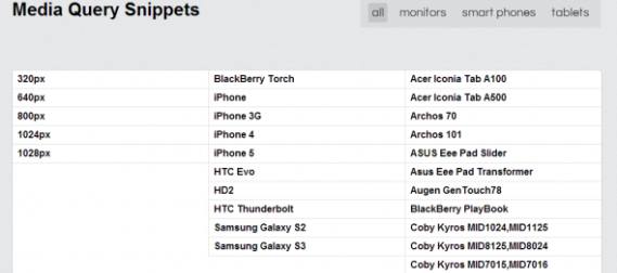
Here is a list of some interesting Media Query Code Snippets for top-notch trendy Gadgets in the market :

Here are some example snippets.
1. iPhone4
@media only screen and (-webkit-min-device-pixel-ratio : 1.5), only screen and (min-device-pixel-ratio : 1.5) { }
2. IPhone5
@media screen and (device-aspect-ratio: 40/71) {    }    or
@media screen and (device-width: 320px)
and (device-height: 568px) and (-webkit-device-pixel-ratio: 2){    }
3. Samsung Galaxy S2
@media only screen and (device-width: 320px) and (device-height: 533px) and (-webkit-device-pixel-ratio: 1.5) {}
4. Blackberry Torch
@media screen and (max-device-width: 480px) { }
5. Blackberry Playbook
c) Code for Applying Styles in Portrait Mode :
 @media only screen (max-device-width: 600px) and (orientation: portrait) { }

d) Code for Applying Styles in Portrait Mode :
@media only screen (max-device-width: 1024 px) and (orientation: portrait) {}
6. Samsung S3
@media only screen and (-webkit-device-pixel-ratio: 2) { }
7. Google Nexus 7
@media screen and (device-width: 600px) and (device-height: 905px) and (-webkit-min-device-pixel-ratio: 1.331) and (-webkit-max-device-pixel-ratio: 1.332) { }
8. IPad Mini
@media screen and (device-width: 768px) and (device-height: 1024px) and (-webkit-device-pixel-ratio: 1) { }
9. IPad 3
Landscape
@media (max-device-width: 1024px) and (orientation: landscape) { }
Portrait
@media (max-device-width: 768px) and (orientation: portrait) { }
10. Galaxy Tab 10.1
Landscape
@media (max-device-width: 1280px) and (orientation: landscape) { }
Portrait
@media (max-device-width: 800px) and (orientation: portrait) { }

