The viewport is the area where the browser renders the site. This is your screen minus the reserved space of the browser chrome. Sometimes you want to size an element based on that viewport, like a sidebar. This can be done using a unit we’re all familiar with: percentages.
.sidebar { width: 25% }
Let’s set the height equal to the viewport.
html, body { height: 100%; }

.sidebar {
  height: 100%;
  width: 100%;
}
What’s going wrong here? Why does html and body require a height? Percentages are relative to it’s parent properties. When the parent’s height is defined by it’s children, there’s no known height to set, so the height is ignored entirely. That means you would have to set the height on every parent element in the DOM tree. You could also use the new viewport units.
Viewport-percentage lengths
The viewport units are a new set of units designed for the challenges we face today. One-pagers, full-width grids, typography, and many other things rely on the size of the viewport. Previously, we hacked these challenges using percentages as mentioned earlier, or JavaScript.
This new set of units consists of four different units. Two for each axis, and a minimum and maximum value of the two.
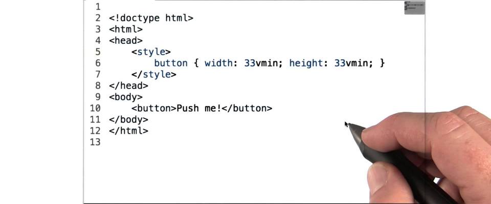
vw: 1/100th viewport widthvh: 1/100th viewport heightvmin: 1/100th of the smallest sidevmax: 1/100th of the largest side
Note: IE9 uses vm instead of vmin. It does not support vmax.
Just to clarify: 1vmax equals 1vh in portrait mode, whilst in landscape mode, 1vmax will equal 1vw.
Caution: one major drawback
Imagine you’re building a full-width square grid using these units. I suppose that would look something like this:
.grid {}

.grid::before,
.grid::after {
  clear: both;
  content: '';
  display: block;
}

.grid__item {
  box-sizing: border-box;
  float: left;
  height: 50vw;
  padding: 2em;
  width: 50vw;
}
At some point, the items will overflow the viewport. On Windows, a scroll bar will appear, slightly shrinking the viewport. On OS X, a smart scroll bar will appear over the content which shows and hides automatically, thus not affecting the viewport. How is that relevant? Here’s a bit of the specification:
When the value of ‘overflow’ on the root element is ‘auto’, any scroll bars are assumed not to exist.
http://www.w3.org/TR/css3-values/#viewport-relative-lengths
That means, when the root element’s overflow is set to auto, which is the default value, scroll bars are assumed not to exist. That means 100vw is the width of the viewport, scroll bar included. In OS X, everything will look fine. On Windows however, the two grid items together are wider than the viewport, scroll bar excluded, thus will be unable to render the two blocks next to each other.
Luckily, this is isn’t a difficult problem to overcome. The easiest way is to simply set the parent’s overflow property to hidden if the parent should grow along with the content. If it should scroll, set it to scroll.
If you’re using the latter but you’re annoyed a scroll bar is displayed even when you cannot scroll, you can use JavaScript to compare the element’s height to the amount of scrolling you can do.
var element = document.documentElement;

if(element.scrollHeight > element.clientHeight) {
  // Overflow detected; force scroll bar
  element.style.overflow = 'scrollbar';
} else {
  // No overflow detected; prevent scroll bar
  element.style.overflow = 'hidden';
}
For more robust implementations to detect whether a scroll bar is visible or not, see “Crossbrowser JavaScript Scrollbar Detection” by Tyler Cipriani or “Detect If a Page Has a Vertical Scrollbar” on Stack Overflow if you prefer jQuery.