
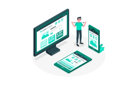
Si estáis desarrolando un sitio o aplicación web Responsive (adaptativa) y todavía no sabes que Media Queries utilizar para los dispositivos que estás soportando el artículo de hoy te vendrá perfecto!
Antes de todo...Que se entiende por Media Query Snippets?
Se llaman Media Query Snippets pequeños fragmentos de código elaborados con las media queries para detectar la mayoría de dispositivos que existen en el momento, desde los monitores normales de los portátiles o computadores de escritorio hasta los smartphones más conocidos, como el iPhone, HTC, Samsung Galaxy y el Blackberry Torch, por supuesto no pueden faltar las tablets, como las Acer Iconia, Google Nexus, iPads, Sony, Lenovo entre otras.
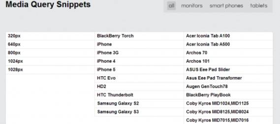
Más informaciones (en inglés): Media Query Snippets
Aquí tenéis algunos útiles ejemplos:
1. iPhone4
@media only screen and (-webkit-min-device-pixel-ratio : 1.5), only screen and (min-device-pixel-ratio : 1.5) { }
2. IPhone5
@media screen and (device-aspect-ratio: 40/71) {    }    or
@media screen and (device-width: 320px)
and (device-height: 568px) and (-webkit-device-pixel-ratio: 2){    }
3. Samsung Galaxy S2
@media only screen and (device-width: 320px) and (device-height: 533px) and (-webkit-device-pixel-ratio: 1.5) {}
4. Blackberry Torch
@media screen and (max-device-width: 480px) { }
5. Blackberry Playbook
c) Code for Applying Styles in Portrait Mode :
 @media only screen (max-device-width: 600px) and (orientation: portrait) { }

d) Code for Applying Styles in Portrait Mode :
@media only screen (max-device-width: 1024 px) and (orientation: portrait) {}
6. Samsung S3
@media only screen and (-webkit-device-pixel-ratio: 2) { }
7. Google Nexus 7
@media screen and (device-width: 600px) and (device-height: 905px) and (-webkit-min-device-pixel-ratio: 1.331) and (-webkit-max-device-pixel-ratio: 1.332) { }
8. IPad Mini
@media screen and (device-width: 768px) and (device-height: 1024px) and (-webkit-device-pixel-ratio: 1) { }
9. IPad 3
Landscape
@media (max-device-width: 1024px) and (orientation: landscape) { }
Portrait
@media (max-device-width: 768px) and (orientation: portrait) { }
10. Galaxy Tab 10.1
Landscape
@media (max-device-width: 1280px) and (orientation: landscape) { }
Portrait
@media (max-device-width: 800px) and (orientation: portrait) { }