Web animations are a joy. They enhance the user experience by providing visual feedback, guiding tasks, and vitalize a website. Web animations can be created in several ways, including JavaScript libraries, GIFs, and embedded videos. But for a few reasons, the simple combination of SVG and CSS is attractive.
Comprised of code rather than thousands of raster image frames, they are powerful and have a faster loading time than heavy GIFs and videos. In addition, there are many simple animations that can be created without adding another JavaScript plugin to the page load of your website. SVGs are based on vectors to boot, so they scale perfectly throughout screen sizes and zoom levels without creating pixelization.
Now, perhaps you're curious to know why CSS? Why not use SMIL? As it turns out, SMIL support is declining.
Chrome is heading towards deprecating SMIL for CSS animations and the Web Animations API.
So we're going with CSS animations... but how are they made?
We're going to learn how to make these lightweight, scalable animations in this article!
A simple middle ground
There is not just one way animate the SVGs: we can use the tag < animate > directly in the SVG code or implement other methods. Today, we're going to look at another way: using inline SVG (SVG code right inside HTML) and animating the parts right through CSS.
We played with this recently as our agency was looking to freshen up the corporate image. Our latest design uses SVG quite a bit and we thought this would be another perfect opportunity to use it some more.
The finished product is pretty simple. Here's it is:
Let's check out how it's done. It's really very simple.
The plan was to make a super simple classic logo, colors, and general branding. Then add a little flair.
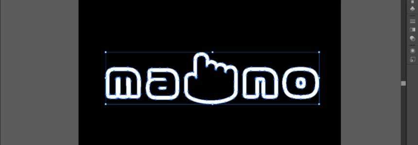
We put all the parts together in Illustrator: letters and icon.
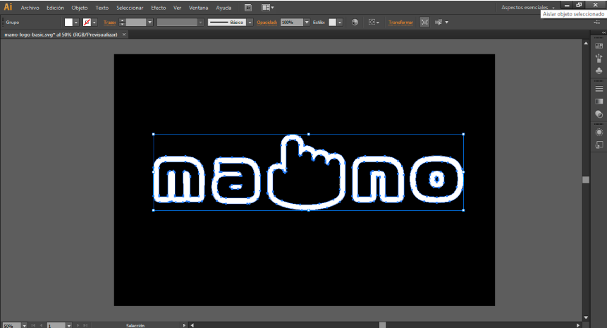
IMPORTANT: the logo and tagline text are outlines. That means they are just vector shapes and will render just perfectly as-is in the SVG, as < path >s.
Then, we save the image directly as SVG.
To optimize it and remove the DOCTYPE and stuff, you might want to run it through SVGO. But more importantly, you're going to want to give the different shape class names for this post, so we can select them and do stuff in CSS!
You can copy-and-paste that SVG right into the HTML. But that'll just slop up the template probably. In all likelihood you'll just do something like:
< img src="/path/image.svg" >
or
< ?php include("path/image.svg"); ? >
Now we have the shapes in the DOM and we can target and style them like any other HTML element, let's do that.
For the first animation , we use < clipPath >: The
A clipping path restricts the region to which paint can be applied. Conceptually, parts of the drawing that lie outside of the region bounded by the clipping path are not drawn.
In thiscase we make a rect element inside a the < clipPath >
< clipPath id="mask" >
< rect x="0" y="0" width="600" height="300" fill="#000" id="#cool_shape" >
< /rect >
< /clipPath >
We then added the < animate> element, which allows us to animate scalar attributes and properties over a period of time.
< animate attributeType="XML" attributeName="manologo" from="-600" to="0"
dur="10s" repeatCount="indefinite"/ >
And...that's it!
SVG Logo animation with CSS
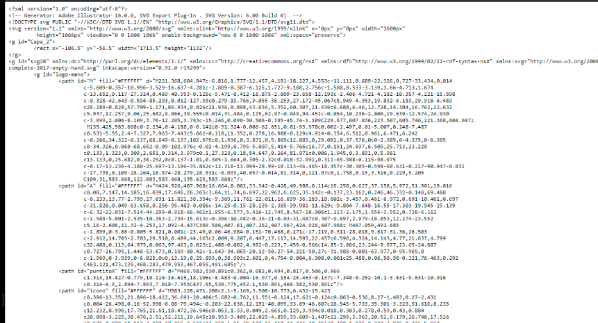
In this case we will use a text-plain svg, to better understand the relationship between the elements.
Anyway, remember to simplify your SVG
When an SVG is created, it has extra code that is often unnecessary. So, optimizing it is important.
Create groups
Open the SVG and take note of the < g > and < path > elements in a code editor. < g > is used for grouping SVG elements. Wrap them in < g> and name them with a class or ID if you want to animate a group of elements together. If you anticipate styling more than one path in the same way, consider converting ID names to class names (IDs can only be used once). You will be able to target them with CSS once you have an ID or class on the shape. For now, there will be no visible change when you save the SVG.
Set SVG styling
SVGs have attributes that are similar to CSS styles but are set directly on the SVG. An obvious example is a fill color. Because these styles are set on the SVG, you should assume that the browser holds a lot of weight, but it is not totally correct. The important thing, as always, is to optimize the code.
Applying CSS to SVGs
Now that we've got the SVG clean, let's get into how to put the CSS in. When it comes to applying CSS to an SVG, there are a few considerations.
We can apply the css in different ways:
1. Embed the SVG code inline in the HTML.
This renders the SVG element and its contents part of the DOM tree of the document, thus affecting them by the CSS of the document. This method separates the styles from the markup.
< rect id="example" width="100" height="10" x="1" y="50" transform="rotate(90 20 14)" />2. Include the CSS in the SVG within
< style > tag
 < svg xmlns="http://www.w3.org/2000/svg" width="48" height="48" viewBox="0 0 48 48" >

< style type="text/css" >

< ![CDATA[

rect { fill: #333; } ]] >

< /style >

< g >
< rect id="example" width="100" height="10" x="1" y="50" transform="rotate(90 20 14)" / >
< /g >

< /svg >
3. Include the CSS in the SVG with an external link
< ? xml-stylesheet type="text/css" href="style.css" ? >
4. Use inline CSS styles in the SVG
< rect id="example" width="48" height="4" x="1" y="23" transform="rotate(90 20 14)" style="fill: #000;"/ >
Ma-No logo example
In this simple animation, we add a class called "mano-letter" to the path element to which we have applied our own CSS animations:
.mano-letter {
-webkit-animation: pop 3s ease alternate infinite;
animation: pop 3s ease alternate infinite;
}
.mano-letter:nth-child(2) {
-webkit-animation-delay: 0.1s;
animation-delay: 0.1s;
}
.mano-letter:nth-child(3) {
-webkit-animation-delay: 0.2s;
animation-delay: 0.2s;
}
.mano-letter:nth-child(4) {
-webkit-animation-delay: 0.3s;
animation-delay: 0.3s;
}
.mano-letter:nth-child(5) {
-webkit-animation-delay: 0.4s;
animation-delay: 0.4s;
}
@-webkit-keyframes pop {
90% {
-webkit-transform: scale(1);
transform: scale(1);
}
100% {
-webkit-transform: scale(1.1);
transform: scale(1.1);
}
}>@keyframes pop {
90% {
-webkit-transform: scale(1);
transform: scale(1);
}
100% {
-webkit-transform: scale(1.1);
transform: scale(1.1);
}
}
#dot {
-webkit-transform: translateY(150px);
transform: translateY(150px);
-webkit-animation: popup 5s 6.5s ease infinite;
animation: popup 5s 6.5s ease infinite;
}
@-webkit-keyframes popup {
0% {
-webkit-transform: translateY(150px);
transform: translateY(150px);
}
34% {
-webkit-transform: translateY(20px);
transform: translateY(20px);
}
37% {
-webkit-transform: translateY(150px);
transform: translateY(150px);
}
100% {
-webkit-transform: translateY(150px);
transform: translateY(150px);
}
}
@keyframes popup {
0% {
-webkit-transform: translateY(150px);
transform: translateY(150px);
}
34% {
-webkit-transform: translateY(20px);
transform: translateY(20px);
}
37% {
-webkit-transform: translateY(150px);
transform: translateY(150px);
}
100% {
-webkit-transform: translateY(150px);
transform: translateY(150px);
}
}
Enjoy the example: