
We are well and truly in the age of the online infographic. Or are we? These colourful ‘data visualizations’ of information have flooded the internet in numbers; however, there’s many of them which just aren’t up to scratch. So, what makes an infographic an infographic? The original definition basically means the visualization of data.
Over the years, though, that idea has been taken further out of context, to the point where anything with pretty (or in many cases, awful) graphics that feature numbers and a few factoids are passed off as an infographic. There many people across a range of industry types, most notably marketing and design, being lazy in their approach towards creating infographics – drawing readers in with colourful graphics, which really show nothing and confuse us even more. This article gives an insight upon what constitutes a true infographic whilst revealing some rather bad practices along the way.
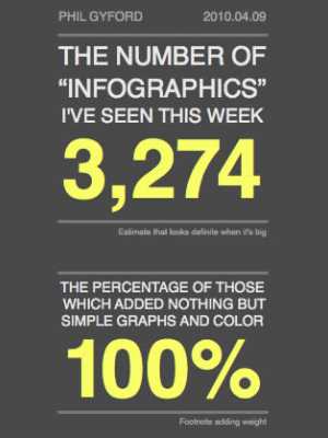
This clearly isn’t an Infograph…
From a marketing perspective, infographics were discovered to be great for attracting links, traffic and, in some cases, building brand awareness. However, following the initial success of infographs, everyone seems to have jumped on the bandwagon; creating them left, right and centre about any topic under the sun.
As a result, the online realm is littered with an abundance of graphics with questionable merit – both in terms of design and content. In many cases, such ‘infographics’ lack informational depth or analysis and, consequently, the representation of data will be completely unimaginative.
A particular standout trait of many modern infographics can include large volumes of text, which often come in the form of step-by-step guides, or historical overviews, and sometimes even list based content, to name but a few. Keeping in mind the origins and purpose behind making infographics (making visual sense out of data) it has to be questioned whether such infographic types are better reserved for article content.
Another debatable facet is in the data, or stats, themselves. Rather than actually ‘visualizing’ raw data and numerical values, some designers instead opt for merely making the numbers look pretty or bold. Depending on what information is being expressed, this isn’t always an issue, but the job of the designer should also be to do something interesting, or visually representative of that raw information.
Design, on the other hand, is very much down to personal tastes and there’s certainly not a ‘one size fits all’ policy when it comes to wireframing and choice of colours, etc. However, a majority of infographics clearly lack aesthetic quality, in comparison to, say, those on specialist sites like Good.is. With these, as well as many other infographs, it’s a case of literally applying ‘information plus graphic’. So, what makes for a truly great infograph?
The recipe for a great infographic
Infographics that really cut the cake successfully combine information and the visual in such a way which it allows the reader to take their own journey through the image – in a nonlinear manner. Furthermore, they make a complex set of data, or information, more digestible.
Infographic designer Francesco Franchi calls the way we interpret a well thought out infograph, ‘infographic thinking‘. Franchi quotes: “Infographic thinking doesn’t let designers to interpret a narrative visually; it lets them invite the viewer [to] join in the process of interpretation, too. It’s what makes infographic design a language, not a formula or a fad”.
On top of this, learning from the examples above; without well thought out content you cannot have intelligent design. Both elements are needed to craft a sterling infographic. Here are some great examples of true infographics.
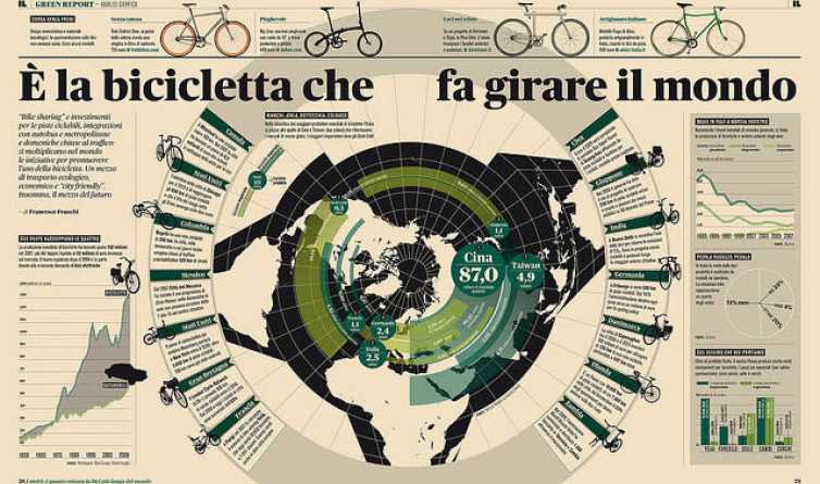
Despite being in Italian, you can see clearly why it is visually stimulating and informative at the same time. The infograph has clearly represented information, style and clever design all packed into one graphic.
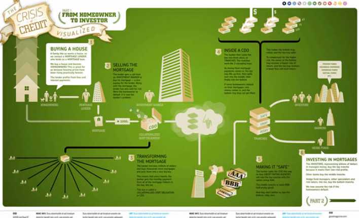
This infograph allows you to explore at your own will; containing relevant interesting figures and stats reinforced visually by top graphics.
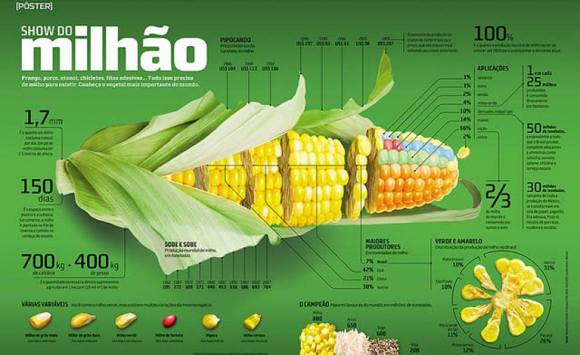
This example has an incredibly high visual appeal; playing on the concept of parts of corn. However, you don’t have to read Portuguese to see that the visual element is completely backed up by appropriate information.

Believe it or not, this clever illustration of the causes of mortality during the Crimean War dates back to 1857 and was created by the infamous Florence Nightingale. Rather than pulling in scattered information from varied sources, you can see how tireless research has gone in to creating this simple representation.
All of these infographics present their given information clearly and succinctly whilst integrating words and graphics together in an intelligent fashion; beautiful, engaging – and easy to understand without having to rely on words alone. In conclusion, infographics have certainly evolved in style, but not necessarily to the point where they can be deemed infographics.
Flow charts and ‘instructographics’, for example, are recent graphic-based trends that do not follow the basic infographic principals of visualizing data in a digestible way. Another side of the coin is that high demand for infographics is opening up doors for design agencies and freelancers (and often in-house designers) who don’t always have the skillset to take raw data and make aesthetic sense of it.
original source: http://speckyboy.com