Responsive web design is a simple technique that makes your website look good across all screen sizes – be it the mobile phone, tablets, desktop computer or even the large-screen TV.
Google has also officially recommended that website owners use the responsive design approach instead of maintaining separate mobile and desktop website as responsive design “keeps your desktop and mobile content on a single URL.

Responsive Google AdSense Ads
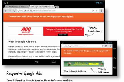
If you been using Google AdSense Ads on your responsive website, you may have noticed that, unlike your content, Google AdSense ads have a fixed width and they will not shrink or expand based on the screen size of the visitor.
For instance, if you are using the standard 728×90 leaderboard unit on your website, the ad unit may extend well beyond the screen if someone is viewing your website on a mobile phone that can only accomodate 320 pixels.
Google AdSense Ads aren’t responsive by default but there’s a simple JavaScript based workaround that will make your Google Ads respond to the screen size. Best of all, the Google AdSense team has officially approved our Responsive Ads technique.
Before we dive into the code, please take a look at this demo page.
The demo has exactly one AdSense unit above the fold but the size of the unit will vary depening on visitor’s screen. If you are viewing the demo on a widescreen, you’ll see a leaderboard ad while a mobile user will see a medium rectangle or even a 180×90 link unit depending on the screen resolution.
Making Google AdSense Ads Responsive with JavaScript
<!-- You can add multiple Adsense Ad units -->
<!-- Just change the ad on Line #4 and Line #7 -->

<div id="google-ads-1">
 <script type="text/javascript">

	adUnit   = document.getElementById("google-ads-1");
	adWidth  = adUnit.offsetWidth;

	/* Replace this with your AdSense Publisher ID */
	google_ad_client = "ca-pub-1234567890";

	if ( adWidth >= 768 ) {
	  /* Leaderboard 728x90 */
	  google_ad_slot	= "AAA";
	  google_ad_width	= 768;
	  google_ad_height 	= 90;
	} else if ( adWidth >= 468 ) {
	  /* Banner (468 x 60) */
	  google_ad_slot	= "BBB";
	  google_ad_width 	= 468;
	  google_ad_height 	= 60;
	} else if ( adWidth >= 336 ) {
	  /* Large Rectangle (336 x 280) */
	  google_ad_slot 	= "CCC";
	  google_ad_width 	= 336;
	  google_ad_height 	= 280;
	} else if ( adWidth >= 300 ) {
	  /* Medium Rectangle (300 x 250) */
	  google_ad_slot 	= "DDD";
	  google_ad_width 	= 300;
	  google_ad_height 	= 250;
	} else if ( adWidth >= 250 ) {
	  /* Square (250 x 250) */
	  google_ad_slot	= "EEE";
	  google_ad_width 	= 250;
	  google_ad_height 	= 250;
	} else if ( adWidth >= 200 ) {
	  /* Ad Link Unit (200 x 90) */
	  google_ad_slot 	= "FFF";
	  google_ad_width 	= 200;
	  google_ad_height 	= 90;
	} else {
	  /* Do not display the Google Ad */
	  google_ad_slot		= "0";
	  adUnit.style.display	= "none";
	}
 </script>

 <script type="text/javascript"
   src="http://pagead2.googlesyndication.com/pagead/show_ads.js">
 </script>
</div>
To get started, create multiple ad units (say 768×90, 468×60 and 300×250) inside your AdSense dashbaord and replace the relevant google_ad_client (ca-pub-1234) and google_ad_slot (AAA, BBB, etc.) identifiers in the code with your own values.
Next, copy-paste the above snippet anywhere on your web page and, based on the size (resolution) of the user’s device, the most appropriate AdSense Ad format will get served automatically. If you wish to include multiple AdSense ad units on the same responsive website, just use the same snippet of code but increment the ID (line #4 & line #8) such that they read google-ads-1, google-ads-2 and so on.
What’s New?
I wrote the first version in August 2012 and the updated code includes several enhancements:
- The previous version used window.innerWidth and window.clientWidth properites to calculate the screen width but there were compatibility issues with older browsers. We are now using offsetWidth to compute the available width for ads which is even more reliable.
- You can now configure JavaScript to not display AdSense ads on very small screens. This is done by not specifying a valid google_ad_slot and setting the display property of the ad unit to “none” so that there’s no blank space anywhere.
- It is now easier to include multiple responsive ad units on single web page.
While it is always a good idea to confirm with your account manager, this technique isn’t against AdSense TOS as we aren’t resizing the ads or modifying the JavaScript code – we are just serving a different ad unit based on the visitor’s browser size.
AdSense publishers routinely perform split A/B testing to determine which colors schemes and banners sizes perform the best on their website – this is a similar technique.
Also see: Google AdSense Sandbox
source:http://www.labnol.org/

