
In order to serve mobile-optimized content, you need to detect which visitors are coming from mobile devices and which aren’t.
Here we have list 8 method to detect mobile browsers so you can chose the best suitable to your needs, and give your user the best experience possible.
#1 PHP User Agent
We can test the user agent comparing with a list of known mobile user agents so you can redirect the user to a different version, add a new cookie, set a global variable to be used in your CMS, set a HTML class or anything else you may want to do.
The PHP code itself is quite simple.We'll use the preg_match() function to compare current browser with an array of mobile browsers:
<?php
//Here is the known mobile user agents list
$mobiles = array("iPhone","iPod");
foreach( $mobiles as $mobile ) {
if( preg_match( "#".$mobile."#i", $_SERVER['HTTP_USER_AGENT'] ) ) {
//Ok, this is a mobile browser, let's redirect it!
header('Location:http://mobile.mysite.com/');
exit();
}}
?>
You can disable this test, via Cookie setting a link to yoursite?nomobile=1 then you can test this var before doing the redirection part:
<?php
//let's check if we have a get or post or cookie set to nomobile
if ( isset( $_REQUEST['nomobile'] ) && true == $_REQUEST['nomobile'] ) {
//now we check if we have set the cookie, so we don't need the "get" in the URL all the time
if ( ! isset($_COOKIE['nomobile']) ) {
setcookie("nomobile", 1, (time()+60*60*24*30) );
}
} else {
//nevermind, let's check if current browser is a mobile
//Here is the known mobile user agents list
$mobiles = array("iPhone","iPod");
foreach( $mobiles as $mobile ) {
if( preg_match( "#".$mobile."#i", $_SERVER['HTTP_USER_AGENT'] ) ) {
//Ok, this is a mobile browser, let's redirect it!
header('Location:http://mobile.mysite.com/');
 exit();
}
}
}
?>
#2 JavaScript User Agent
The JS is more suitable for places where you have little or no control on the server side code, or you want to do something specific (like a landing page).
Moreover, the JS code is quite limited because you need to load the entire site before doing the redirection.
So, here is an example:
<script type="text/javascript">
var mobiles = array["iPhone", "iPod"];//mobile devices
var i;        for(i=0;i< mobiles.lenght;i++){
 //testing if the RE matches the mobile agents
var er = new RegExp(mobiles,"i");
if( er.test( navigation.userAgent ) ) {
window.location = "http://mobile.mysite.com/" ;
}}
</script>
#3 WordPress code
WordPress actually has an internal mobile sniffing tool so you’ll have a global variable to tell you if the current user is an iPhone or not (and a few other browsers).
Here is an example:
<?php
function load_my_styles() {
global $is_iphone; //loading global var here
if( $is_iphone ) {
wp_enqueue_style( 'iphone-style', get_stylesheet_directory_uri() . '/ iphone-style.css');
} else {
wp_enqueue_style('normal-style', get_stylesheet_directory_uri() . '/ style.css');
 }
 }
 add_action( "wp_enqueue_scripts", "load_my_styles" );
?>
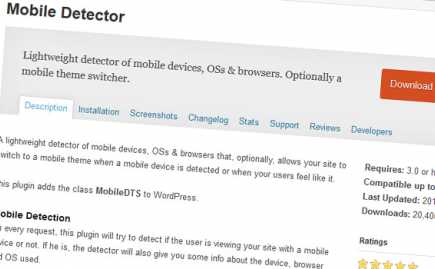
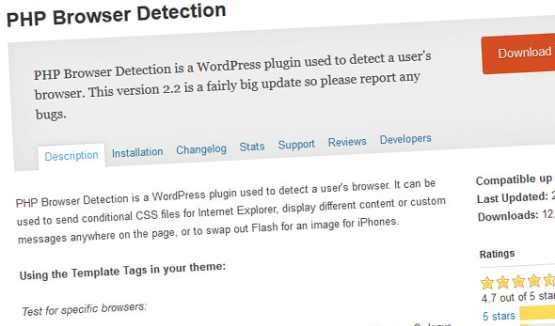
#4 WordPress Plugins
Here are some options:
#5 HTML Code for Retina
This is a simple way to be done in your
, while you’re calling your styles:
<link rel="stylesheet" type="text/css" src="css/common_style.css" />
<link rel="stylesheet" type="text/css" src="css/retina.css" media="only screen and (-webkit-min-device-pixel-ratio:2)" />
#6 Media queries
The media queries allow you to conditionally apply styles.
/* Smartphones (portrait and landscape) ----------- */
@media only screen   and (min-device-width : 320px)
and (max-device-width : 480px) {  /* Styles */  }    /*
Smartphones (landscape) ----------- */
@media only screen   and
(min-width : 321px) {  /* Styles */  }
 /* Smartphones (portrait) ----------- */
@media only screen   and (max-width : 320px)
 {  /* Styles */  }
/* iPads (portrait and landscape) ----------- */
@media only screen   and (min-device-width : 768px)
 and (max-device-width : 1024px) {  /* Styles */  }
 /* iPads (landscape) ----------- */
@media only screen   and (min-device-width : 768px)
and (max-device-width : 1024px)   and (orientation : landscape) {  /* Styles */  }
/* iPads (portrait) ----------- */
@media only screen   and (min-device-width : 768px)
and (max-device-width : 1024px)   and (orientation : portrait) {  /* Styles */  }
/* Desktops and laptops ----------- */  @media only screen   and (min-width : 1224px) {  /* Styles */  }
 /* Large screens ----------- */
@media only screen   and (min-width : 1824px) {  /* Styles */  }
/* iPhone 4 ----------- */  @media  only screen and (-webkit-min-device-pixel-ratio : 1.5),
only screen and (min-device-pixel-ratio : 1.5) {  /* Styles */  }
If you want to target only retina devices you can try:
@media only screen and (-webkit-min-device-pixel-ratio:2){ }
#7 Media Queries via JavaScript
An obscure technique perhaps...
You can test media queries using JavaScript, and if returns true, for example, you could conditionally change classes, change image src attributes, redirect your page.
<script type="text/javascript">
//JS version for the retina query
var modern_media_query = window.matchMedia( "screen and (-webkit-min-device-pixel-ratio:2)");
if( modern_media_query.matches ){
//DO ALL THE THINGS HERE      }
</script>
#8 Htaccess code
The idea is similar to the first PHP method.
RewriteCond %{HTTP_USER_AGENT} “ipod|iphone|ipad|blackberry”[NC]
RewriteCond %{REQUEST_URI} ^/$
RewriteRule ^ http://m.yoursite.com%{REQUEST_URI} [R,L]

Janeth Kent
Licenciada en Bellas Artes y programadora por pasión. Cuando tengo un rato retoco fotos, edito vídeos y diseño cosas. El resto del tiempo escribo en MA-NO WEB DESIGN AND DEVELOPMENT.
Related Posts

Android Hidden Codes: unveiling custom dialer codes and their functionality
In the world of Android smartphones, there exist numerous hidden codes that can unlock a treasure trove of functionalities and features. These codes, known as custom dialer codes, provide access…

How to make your own custom cursor for your website
When I started browsing different and original websites to learn from them, one of the first things that caught my attention was that some of them had their own cursors,…

8 benefits of having a website for your business
At this moment, the Internet is a phenomenon that is sweeping the world. It has been able to interconnect millions of users all over the planet. People have made the…

Open source web design tools alternatives
There are many prototyping tools, user interface design tools or vector graphics applications. But most of them are paid or closed source. So here I will show you several open…

How to create a .onion domain for your website
The dark web, a hidden network accessed through the Tor browser, offers enhanced privacy and anonymity for websites. To establish a presence on the dark web, you can create a…
Secret iPhone codes to unlock hidden features
We love that our devices have hidden features. It's fun to learn something new about the technology we use every day, to discover those little features that aren't advertised by the…

How to access webcam and grab an image using HTML5 and Javascript
We often use webcams to broadcast video in real time via our computer. This broadcast can be viewed, saved and even shared via the Internet. As a rule, we need…
How to Send Email from an HTML Contact Form
In today’s article we will write about how to make a working form that upon hitting that submit button will be functional and send the email (to you as a…

How to multiply matrices in JavaScript
It may seem strange to want to know how to multiply matrices in JavaScript. But we will see some examples where it is useful to know how to perform this…

JavaScript Formatting Date Tips
Something that seems simple as the treatment of dates can become complex if we don't take into account how to treat them when presenting them to the user. That is…
How to set up your Android phone: learn how to get your new phone up and running
If you've just bought a great new Android phone, you'll want to start using it as soon as possible. You'll see that it's not hard to get the initial set-up and…

Top tools for UX design and research
This article is a compilation of the "ux tools" I have tested in recent years. I've separated the tools by categories, although I recommend you to take a look at all…